
A visitor consults your site from their phone, they are interested, they want to contact you : what do they do ? If they have to write down your number, open their phone app, retype it… many will abandon the process. Yet, on mobile, there is an obvious and highly effective solution : the direct call button. A simple « Call » button that, with a single tap, initiates a call to your number. For any activity where a phone call is involved, it’s one of the most profitable additions you can make. Here’s why and how to add a direct call button to your mobile site, and the precautions to take.
Why a call button changes everything on mobile
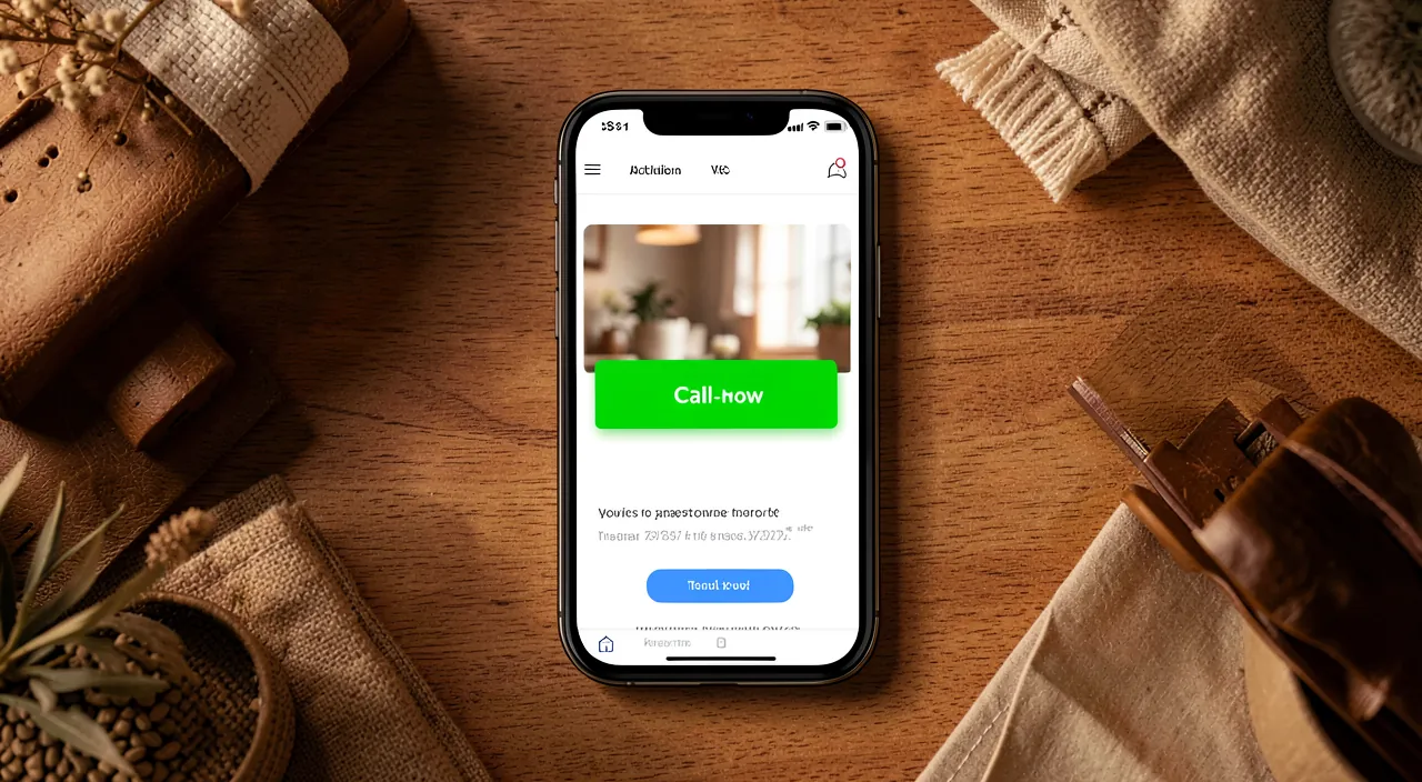
On mobile, the simplicity of contact is decisive. THE STAT : a large part of website visits are now done on mobile ; yet, on a small screen, each additional step to contact you leads to lost connections ; writing down a number, switching apps, retyping it : all opportunities for abandonment. THE SOLUTION : the direct call button ; on mobile, a link or button can directly trigger a call to your number ; the visitor taps once, and their phone immediately offers to call ; it’s immediate, without friction. Why is it so EFFECTIVE ? Because the phone is already… a phone ; the visitor has the tool in hand ; removing any steps between the desire to contact you and the call maximizes contact opportunities. FOR WHICH activities ? All those where the PHONE is an important channel : artisans, plumbers, restaurants (reservations), taxis, freelancers, shops, emergency services, appointment booking ; everywhere where a call is better than a form, or complements it. How does it work technically ? It’s simple : a special link associated with your number makes that, on mobile, tapping the button initiates the call ; most website creation systems allow you to easily add such a button, or even automatically detect and make numbers clickable. WHERE TO PLACE IT ? In plain sight : at the top of the page, in the menu, at the bottom of the page, on the contact page, and sometimes as a floating button always visible while scrolling ; the idea is that it’s always within reach. WHAT DOES IT DO ? It ENSURES easy contact (less friction, more calls) ; it AVOIDS losing customers (who would abandon if forced to copy a number) ; it CONVERTS interest into immediate action ; and it REASSURES (contacting you is easy). The main idea : on mobile, the direct call button removes any friction between the desire to contact you and the actual call ; for an activity where the phone is important, it’s one of the simplest and most profitable additions. The visitor already has a phone in hand : give them a button to tap, and you transform more interests into real contacts. A small technical detail, a big commercial effect.
The call button makes it super easy for someone on their phone to contact you. Instead of copying a number or switching apps, they just tap a button and the call starts. This works best for businesses where phone calls are important, like restaurants or plumbers. It’s a small change that can lead to more customers.
A pizza restaurant adds a “Call Now” button to their mobile site. Before, customers had to copy the number and dial it manually. After adding the button, calls from the website increased by 30% because it was so much faster and easier.
How to add and place the call button
Here’s how to set up an effective call button. ADD the call button — in your website creation system, add a button associated with your phone number, configured to initiate a call ; most tools offer this function (a « phone » type link, or a dedicated button block) ; some even automatically make your numbers clickable. A CLEAR LABEL — the button should clearly state its action : « Call », « Call Us », « Call Us Now », possibly with the number visible and a small phone icon ; the visitor should understand at a glance. PLACE it well in sight — the button should be easy to find : at the top of the home page, in the menu, on the contact page, at the bottom of the page ; the ideal is that it’s visible without having to search. Consider a floating button — on mobile, a floating call button that stays displayed at the bottom of the screen while scrolling is very effective : the visitor can call at any time, wherever they are on the page ; use it sparingly to avoid disrupting reading. Make it big enough — a button easy to tap with a finger : large enough with space around it, in a contrasting color ; a tiny button is frustrating on mobile (our guides on clear and easy-to-click buttons). Adapt to mobile — the call button is especially useful on mobile (on a computer, tapping the button may open a call app or do nothing) ; some sites display the call button only on mobile, and write the number on a computer ; think of both cases. Also display the number in plain text — in addition to the button, writing the number visible complements those who prefer to call from another device or write it down ; it’s complementary. Indicate the HOURS — specify when you are available to be reached, to avoid empty calls and disappointments ; it’s more professional and reassuring. TEST it — verify, from a real phone, that tapping the button initiates a call to the correct number. A few TIPS : visible and easy to tap ; complement with the number written and hours ; and offer other contact methods (form, email) for those who don’t like to call (our guides on an effective contact form). In summary : add a well-labeled and well-placed call button (possibly floating), large enough for the finger, adapted to mobile, complemented by the number in plain text and hours, and test it. You significantly facilitate contact.
- ADD the call button in your website creation system, associated with your phone number.
- USE a clear label like « Call » or « Call Us Now », with a phone icon if possible.
- PLACE it where it’s easy to find: top of the page, menu, contact page, or as a floating button.
- MAKE it big enough for a finger tap and in a contrasting color.
- ADAPT to mobile (display the button only on mobile if needed).
- SHOW the number in plain text as well, and indicate your availability hours.
- TEST the button from a real phone to ensure it works correctly.
The right reflex. Think about the visitor’s journey on their phone : they found you, they are interested, they want to call you NOW. Each additional step you impose on them — writing down the number, switching apps, retyping it — is an opportunity to abandon. The direct call button removes all this : a tap, and the call is initiated. To be effective, make it impossible to miss : a clearly labeled button (« Call », « Call Us »), with a phone icon, large enough to be tapped easily with a finger, in a contrasting color. Place it well in sight — at the top of the home page, in the menu, on the contact page — and especially consider a floating button that stays displayed at the bottom of the screen while the visitor scrolls : thus, wherever they are on your site, they can call you when the urge strikes. It’s particularly effective for activities where decisions are made quickly (plumbers, restaurants, taxis). Two important complements : first, also display the number in plain text next to the button for those who prefer to call from another device or write it down ; second, indicate your availability hours so that the visitor knows when to call and avoid empty calls — it’s more reassuring and avoids disappointments on both sides. Finally, always test that the button initiates a call to the correct number from a real phone. And don’t forget that not everyone likes to call : offer a form or email as well. A well-visible and well-made call button is one of the smallest additions for the biggest effect on your contact opportunities : don’t let an interested visitor leave because they couldn’t reach you in one gesture.
Precautions and special cases
The call button is simple, but a few points deserve attention. The RIGHT NUMBER : carefully check that the button dials the correct number ; an error here sends your clients elsewhere ; test from a real phone. Attention to your PRIVATE LIFE : display only a PROFESSIONAL or dedicated number for your activity, never your personal private number if you don’t want it to be public ; once online, a number is visible to everyone, including telemarketers and undesirables ; for a small business, consider a dedicated number rather than your personal mobile ; you separate your private life from your activity and can manage it (filter, cut off outside hours) without affecting your personal life. The flip side of visibility — telemarketing and unwanted calls — is to be accepted in knowledge or limited by these means. Do not replace other contact methods : not everyone likes or can call (people who are uncomfortable speaking, off-hours, the deaf and hard of hearing) ; the call button COMPLEMENTS, but does not replace, a form, an email, or a message ; offer choices. The INVASIVE floating button : a floating button is effective, but if it hides content or disrupts reading, it annoys ; dose its size and placement. COHESION : the button should integrate with your site’s style (colors, shape), while remaining well visible. Finally, ACCESSIBILITY : a good label, sufficient size, good contrast make the button usable by all. In summary : check the right number, protect your private life (professional number, not your personal mobile), ensure availability or indicate hours, display the number in plain text, accept the flip side of telemarketing, complement with other contact methods, and integrate the button with restraint. Thus, it becomes an asset without drawbacks.
Caution : do not expose your personal number — and ensure you can answer. Two important precautions before adding a call button. The first concerns your PRIVATE LIFE. A phone number displayed on a public website becomes visible to ALL, forever : clients, but also telemarketers, call robots, and all kinds of undesirables. Therefore, never put your personal and private number online if you want to keep your peace : use a professional or dedicated number for your activity. For a small business or an independent, it may be wise to get a specific number for work rather than exposing your personal mobile : you separate your private life from your activity, and can manage it (filter, cut off outside hours) without affecting your personal life. The flip side of visibility — telemarketing and unwanted calls — is to be accepted in knowledge or limited by these means. The second precaution : a call button ENCOURAGES calling ; still, you must be able to ANSWER. A client who, seduced by the ease of the button, calls and is systematically sent to voicemail or a silent answering machine will soon lose interest and go elsewhere : the effect becomes counterproductive. Ensure you are available, or at least clearly indicate your availability hours (so the visitor knows when to call) and have an alternative in case of absence. Finally, absolutely verify that the button dials the RIGHT number : test it from a real phone, because an error would send your clients into the void, or worse, to someone else. Last point : not everyone likes or can call (people who are uncomfortable speaking, the deaf and hard of hearing, or reachable only at off-hours) ; the call button should COMPLEMENT your other contact methods (form, email, message), never replace them. A well-chosen professional number, real availability, a tested button, and alternatives for those who don’t call : this is how the call button becomes an asset without exposing you or disappointing anyone.
Frequently asked questions
How to make my phone number clickable on mobile?
It’s simpler than it seems, and most tools facilitate it. The technical principle : a phone number can be transformed into a special link that, when tapped on a mobile, immediately proposes to make the call. In practice, you have several options depending on your website creation system. Many tools automatically detect phone numbers you write and make them clickable on mobile without any special action. Otherwise, most offer adding a button and choosing « call a number » as the action (or a « phone » type link) : you indicate your number, and the button is ready. If you manipulate the content directly, there is a dedicated link type for phone numbers (your tool or its help will indicate this). In all cases, look for « call button », « phone link », or « clickable number » in your website creation system. Once the button is created, give it a clear label (« Call »), place it in plain sight, and especially TEST it from a real phone : tap it and verify that it proposes to call the correct number. Also think about displaying the number in plain text next to it for visitors on a computer or those who prefer to write it down. In a few minutes, you offer your mobile visitors the possibility to contact you with a single gesture.
Does the call button work on a computer too?
Not always the same way, and that’s why you need to plan for both cases. The call button is designed primarily for MOBILE, where the visitor has a phone in hand : tapping the button initiates the call, which is perfectly natural. On a COMPUTER, however, the behavior varies : if the computer has an app capable of making calls (some calling software, or a linked phone), tapping the button may propose to call via this app ; but if no calling app is installed, the button may do nothing useful, or display a message. The visitor on a computer could thus be surprised by a « Call » button that does nothing. The solution is simple : always display your phone number in plain text, clearly written, in addition to the button. Thus, the visitor on a computer can read it and dial it on their own phone, while the mobile visitor benefits from the clickable button. Some sites go further and display the call button only on mobile (where it is fully useful), and the number written on a computer. In all cases, the important thing is that, regardless of their device, the visitor can easily get your number and contact you. The call button is a great addition on mobile ; the number displayed in plain text is the safety net that works everywhere. Combine the two, and you cover all cases.
Should I use a call button or a contact form?
Both, as they serve different needs and people : the best is to offer the CHOICE. The call button is ideal for IMMEDIATE contacts and quick decisions : a customer with an urgency (a repair), a quick question, or the desire to speak to a human immediately will prefer to call ; it’s direct, warm, and allows for real-time interaction. It’s particularly suited to activities where the phone is natural (craftsmen, restaurants, services). The contact form, on the other hand, is better for other situations : people who don’t like or can’t call (due to shyness, deafness, or because they visit outside your hours), detailed requests that require writing, or those where you need to provide information. The form also allows the visitor to contact you at any time, even when you’re not available. Rather than choosing, offer BOTH : a visible call button for those who want to contact you immediately, AND a form (or an email address, a message) for others ; add your hours for the phone as well. You capture all profiles : the impatient who calls, the discreet who writes, the late-night sender. Multiplying contact methods, each clear and easy, maximizes your chances of turning an interested visitor into a client ; forcing everyone to use a single channel loses some along the way (our guides on an effective contact form).
What to remember
On mobile — where a large part of visits come from — the direct call button is one of the simplest and most profitable additions for an activity where the phone is important. Its principle : removing any FRICTION between the desire to contact you and the actual call. Rather than forcing the visitor to write down your number, switch apps, and retyping it (all opportunities for abandonment), a simple « Call » button initiates a call with a single tap ; the visitor already has a phone in hand, so just give them the button. To be effective : a clear label with an icon, a button large enough for a finger, well in sight (top of the page, menu, contact page), and possibly a floating button at the bottom of the screen for easy access during reading. Always complement it with the number displayed in plain text (useful on a computer and for those who prefer to write it down) and your availability hours. Test it from a real phone. But respect two precautions : first, protect your PRIVATE LIFE by exposing only a professional or dedicated number, never your personal private mobile, because an online number attracts also telemarketers and undesirables ; second, ensure you can ANSWER (or indicate your hours and have an alternative), because a button that encourages calls in the void becomes counterproductive. Finally, the call button COMPLEMENTS but does not replace your other contact methods : not everyone likes or can call, so offer a form or email as well, and let the visitor choose. For a minimal technical effort, the call button transforms more interested visitors into real contacts : don’t let a potential customer leave because they couldn’t reach you in one gesture. A small button, a big effect.
Your business deserves a real online presence : website, shop, SEO — we create the site that matches you.
Leave a Reply
You must be logged in to post a comment.