
Your home screen is the first thing you see when you turn on your phone, and the place where you launch your apps dozens of times a day. Yet many people leave it in a mess: apps scattered, endless pages, missing widgets. Personalizing it isn’t just about aesthetics: a well-organized home screen saves you time, helps you focus on what’s essential, and makes using your phone more enjoyable. Here’s how to tidy up, customize, and optimize your home screen, whether you have an iPhone or an Android.
Why organize your home screen
A well-kept home screen really changes your daily life: let’s see why it’s worth it. TIME SAVED: you open your favorite apps dozens of times a day; if they’re well-placed and easy to find, you save precious seconds each time—seconds that add up. MENTAL CLARITY: a screen cluttered with disordered icons and endless pages is a source of distraction; a streamlined screen, where only the essentials are visible, helps you focus and avoids getting lost. CONTROL over your attention: prioritizing useful apps and RELEGATING (or hiding) time-consuming or distracting apps is a powerful way to regain control over your screen time (see our guides on taking control of your screen time); what you see first, you open first. PLEASURE: a wallpaper you like, an organization that suits you, make using the phone more enjoyable; it’s your most personal object, so it should suit you. EFFICIENCY: with widgets, the home screen can directly display useful information (weather, calendar, next step) without even opening an app. The good news: customizing your home screen is SIMPLE, free, and reversible; you can reorganize everything without breaking anything, and go back if a choice doesn’t work. THE GUIDING PRINCIPLE: your home screen should highlight what you use OFTEN and VOLUNTARILY, and move the rest aside; it’s not a showcase where everything must be visible, but a personal tool optimized for YOUR use. Organizing your home screen is ultimately about organizing your daily relationship with your phone.
A tidy home screen saves time, reduces distractions, and makes your phone more enjoyable. It’s like cleaning your desk: only keep what you use often, and move the rest out of sight.
Basic gestures: move, organize, delete
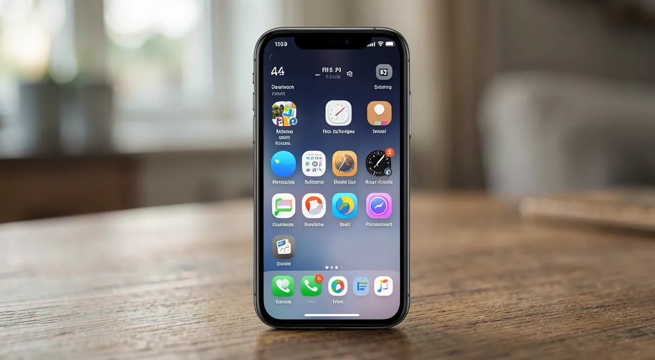
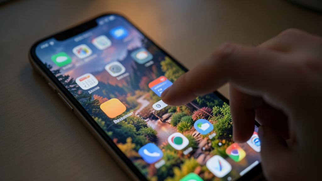
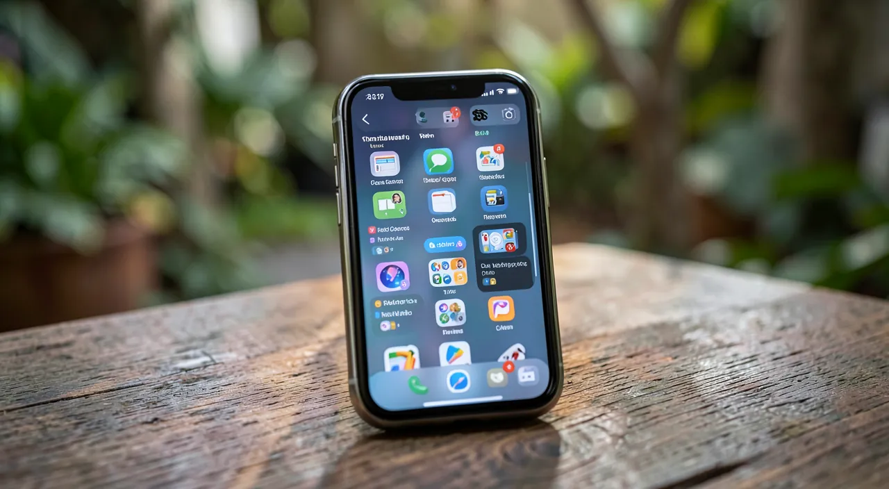
Let’s start with the fundamental manipulations, common to both iPhone and Android. MOVING an app: press and hold its icon until it “shakes” or a menu appears, then drag it where you want (including to another page by dragging it to the edge); release to place it. This is the basic gesture to reorganize everything. CREATING a FOLDER: drag an app ON TOP of another; a folder is automatically created, grouping the two; you can rename it (by theme: “Networks,” “Photos,” “Travel”) and add other apps; folders declutter the screen by grouping apps by category. REMOVING an app from the screen: on iPhone, a long press offers “Remove from Home Screen” (the app stays in the app library, it’s not deleted) or “Delete App” (uninstallation); on Android, you can “Remove” (from the screen) or “Uninstall”; important distinction: REMOVING from the screen ≠ DELETING the app. THE BOTTOM BAR (the dock): the few icons at the bottom remain visible on all pages; reserve them for your 4 MOST used apps; you can change them (drag an app in, drag one out). ORGANIZING PAGES: on multiple pages, put only the essentials on the FIRST one (the one that appears when you unlock); move the rest to the following pages. These basic gestures—moving by long press, grouping into folders, removing or deleting, taking care of the dock and the first page—are already enough to transform a messy screen into a clear and efficient space. Take five minutes to place your essential apps where your thumb can easily reach them.
If you use Maps, Messages, and Photos daily, place them in the dock. Move social media apps to a second page to reduce mindless scrolling.
Widgets, wallpapers, and advanced features
Beyond organization, several features allow for real customization. WIDGETS: these are “tiles” that directly display information or shortcuts on the home screen, without opening the app—weather, next calendar appointment, battery, photos, notes, shortcuts… To add them: long press on the screen → “+” button (iPhone) or “Widgets” (Android), choose the widget and its size, place it; widgets make the screen lively and useful (see the weather or your calendar at a glance, without opening anything). Don’t multiply them: a few well-chosen widgets are better than a cluttered screen. THE WALLPAPER: change it to a photo or image you like (Settings → Wallpaper); on iPhone, you can have a different wallpaper on the lock screen and the home screen, and customize the lock screen (widgets, time style). THE APP LIBRARY (iPhone) / THE APP DRAWER (Android): all your apps are automatically stored there; this allows you to keep the home screen streamlined with only your favorites, the others remaining accessible in the library; on iPhone, you can even choose to have new apps go directly to the library without cluttering the screen. DARK MODE and custom display settings also personalize the atmosphere (see our guides on enabling dark mode). On Android, customization often goes further: you can change the “launcher” (the home interface), the icons, the grids; on iPhone, Shortcuts even allow you to customize the icons. FOCUS/MODES of concentration: a very useful advanced feature—you can have DIFFERENT home screens depending on the context (a “Work” screen that hides personal apps, a “Personal” screen in the evening), activated automatically based on time or location; powerful for separating uses. The idea: these tools allow you to go beyond simple organization, for a home screen that displays useful information (widgets), reflects your tastes (wallpaper), remains streamlined (app library), and adapts to the context (focus modes).
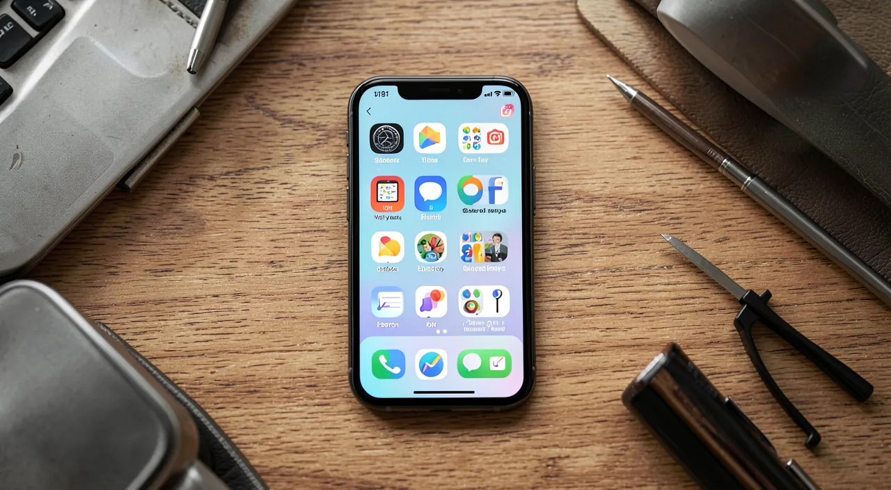
The “minimalist home screen” method: only keep the essentials visible. The most effective and restful organization is to RADICALLY streamline your first page. Here’s how to do it. Step 1: identify your TRULY essential apps—those you open several times a day voluntarily (phone, messages, camera, a few key apps). Step 2: place ONLY these on the first page (and in the bottom dock for the 4 most used); leave space, add one or two useful widgets (calendar, weather) if needed. Step 3: move EVERYTHING else aside—organize secondary apps into themed folders on a second page, or better, REMOVE them from the home screen (they remain in the app library on iPhone, the app drawer on Android, accessible when you really need them). Step 4: deliberately move TIME-CONSUMING apps (social networks, games) away; DO NOT put them on the first page or in the dock; moving them aside (or removing them from the screen) creates a helpful “brake”: you no longer open them by reflex, but only when you decide to (see our guides on taking control of your screen time). The principle: what you see first, you open first; so only display what deserves your attention. Result: a clear, restful home screen where you instantly find the essentials, without being distracted. Unlike the reflex “display everything to have it all at hand,” minimalism saves time AND serenity: relegated apps are just a search away, never lost, but they no longer distract you. Try it for a week: you rarely go back to the cluttered screen.
Adapt your screen to your uses
Beyond general recipes, the best home screen is the one that matches YOUR uses. Think about your THUMB: on a large phone, the top of the screen is hard to reach one-handed; place the most used apps at the BOTTOM and in the center, within thumb reach; comfort of use matters as much as aesthetics. Group by CONTEXT: some organize by theme (work, leisure, home), others by frequency of use, others by time of day; there’s no single rule—find what makes sense FOR you. Use FOCUS MODES if your uses are very different (work vs. personal): a screen per context avoids mixing and distractions. Adapt for ACCESSIBILITY: you can enlarge icons and text, increase contrasts, simplify the display; useful for everyone, essential for those with vision difficulties (see our guides on making your phone more readable). Think about LOVED ONES: if you’re setting up a phone for an elderly parent, a STREAMLINED home screen with LARGE icons of only the useful apps (phone, messages, photos), without frills or multiple pages, makes the phone much easier to use; it’s a real service. LET IT EVOLVE: your uses change; reorganize from time to time, remove apps you no longer open, highlight new habits; a home screen isn’t set in stone. DON’T MAKE IT AN OBSESSION: the goal is comfort and efficiency, not aesthetic perfection; a “good enough” organization that serves you well is better than an endless quest for the perfect screen. The principle: your home screen is a PERSONAL tool; adapt it to your hand, your contexts, your accessibility needs, and let it evolve with you. That’s how it really improves your daily comfort.
Warning: “remove from screen” is not “delete”—and don’t give in to clutter. A few things to keep in mind. First, a common confusion: on iPhone and Android, REMOVING an app from the home screen does NOT UNINSTALL it; it remains installed, accessible in the app library (iPhone) or the app drawer (Android); this is actually practical for streamlining the screen without losing anything. On the other hand, choosing “Delete App” / “Uninstall” does delete the app (and sometimes its data); so read the option carefully: to declutter the screen, “Remove” is enough; only “Delete” if you really want to uninstall (and then check that you’re not losing important data—see our guides on uninstalling software properly). Second point: OVERLOAD. The temptation to put everything on the home screen “to have it all at hand” has the opposite effect: an unreadable screen where you can’t find anything; fewer visible icons = more efficiency. Resist accumulation. Third point: beware of TIME-CONSUMING apps in plain sight; placing them on the first page or in the dock pushes you to open them by reflex; if you’re trying to better control your screen time, deliberately move them aside (see our guides on taking control of your screen time). Fourth point: if you install a third-party “launcher” or icon packs on Android, or complex shortcuts, favor reliable sources and don’t give excessive permissions to these tools; beware of customization apps full of ads or asking for too many accesses. Finally, don’t spend hours tweaking; the home screen is a tool for your comfort, not a work to perfect endlessly. Personalize, yes; drown in settings, no: aim for the simple, the clear, the useful.
Frequently asked questions
How do I move or organize my apps?
It’s simple and done with a long press. To MOVE an app: press and hold its icon until it starts to “shake” (iPhone) or a menu/edit mode appears (Android), then DRAG it to the desired location—on the same page, or to another page by dragging it to the edge of the screen; release to place it. To create a FOLDER and group apps: drag an icon ON TOP of another; a folder is automatically created with the two; you can rename it (by theme) and add other apps by dragging them in; it’s ideal for organizing by category and decluttering. To change the icons in the BOTTOM BAR (the dock, visible on all pages): drag your most used apps into it, drag others out; reserve these prime spots for your 4 favorite apps. When you’re done, tap “OK”/“Done” or press elsewhere to confirm. All of this is reversible; you can reorganize as many times as you want without breaking anything. Take a few minutes to place your essential apps within thumb reach: it’s a small effort that improves every use of your phone.
What are widgets for?
Widgets are “tiles” placed on your home screen that display information or shortcuts DIRECTLY, WITHOUT opening the corresponding app. Common examples: WEATHER (see the temperature and forecasts at a glance), CALENDAR (your next appointment), CLOCK, BATTERY, SLIDESHOW PHOTOS, NOTES, shortcuts to actions… Their interest: making the home screen more ALIVE and USEFUL; information comes to you without any manipulation; you see your day or the weather as soon as you unlock. To add them: long press on an empty area of the screen, then the “+” button (iPhone) or “Widgets” (Android); browse the available widgets (each app can offer its own), choose the size, and place it on the screen. Tip: don’t add too many; a few well-chosen widgets (weather, calendar) provide real comfort, while a screen covered with widgets becomes cluttered and confusing again. Choose those that give you information you really check often: that’s where they save time.
Can I hide apps I don’t use often?
Yes, absolutely, and it’s great for keeping a streamlined screen. On IPHONE: a long press on an app then “Remove from Home Screen” removes it from the screen while keeping it in the APP LIBRARY (accessible by swiping to the far right, where all your apps are automatically stored); the app isn’t deleted, just stored. You can even set the phone so that new apps go directly to the library without cluttering the home screen. On ANDROID: apps are accessible in the APP DRAWER (the upward swipe or dedicated icon); you can remove an app from the home screen (it stays in the drawer), and some launchers even allow you to HIDE apps. The benefit of hiding rarely used apps: a clear home screen with only your favorites, without losing access to the others (a search or a trip to the library/drawer is enough to find them). It’s also a good way to move distracting apps away: relegated out of sight, you open them less by reflex. In short: yes, hide secondary apps without hesitation; they remain installed and accessible, but no longer clutter your home screen.
What to remember
Customizing your home screen isn’t just about aesthetics: it’s about saving time, gaining clarity, and taking control of your phone use. THE GUIDING PRINCIPLE: highlight what you use often and voluntarily, move the rest aside; your screen is a personal tool, not a showcase where everything must be visible. BASIC GESTURES: long press to move an icon; drag an app onto another to create a themed folder; take care of the bottom dock (your 4 favorite apps, visible everywhere); only keep the essentials on the first page. CUSTOMIZATION FEATURES: WIDGETS (weather, calendar…) display useful info without opening an app; the WALLPAPER reflects your tastes; the app library (iPhone) / app drawer (Android) lets you keep the screen streamlined by storing secondary apps; FOCUS MODES offer different screens depending on the context (work, personal). The most restful method is MINIMALISM: only keep the essentials visible, move or hide the rest, and deliberately move time-consuming apps aside (what you see first, you open first). ADAPT to your uses: place apps within thumb reach, organize according to what makes sense for you, think about accessibility (large icons, contrast)—a real service for an elderly loved one—and let it evolve with your habits. Beware of two pitfalls: “remove from screen” is NOT “delete” (the app stays in the library), and clutter harms (fewer visible icons = more efficiency). Everything is reversible: reorganize without fear. A well-thought-out home screen is a phone that’s faster to use, more restful to look at, and better aligned with what really matters to you.
Want to gain confidence with your digital tools? Our personalized training adapts to your level.
Leave a Reply
You must be logged in to post a comment.