
You publish an article, a page, quality content: what if your visitors SHARED it themselves with their entourage? That’s the whole point of social sharing buttons—those small icons “Share on Facebook, WhatsApp…” that allow a reader to spread your content in one click. Well used, they extend your reach for free. But poorly placed or too numerous, they clutter, slow down, and raise privacy concerns. Here’s how to add useful, effective, and respectful sharing buttons, without falling into the traps.
What are sharing buttons for?
Let’s understand the purpose of these buttons before adding them. A SHARING button allows a visitor to SHARE your content (article, page, product) to their own networks or contacts in one click: share on a social network, send via messaging (WhatsApp…), by email, etc.; the visitor becomes a RELAY for your content to their entourage. THE INTEREST: extending your REACH for free; when a reader shares your article, they introduce it to their network, who then discovers you in turn; it’s digital word-of-mouth, particularly valuable as content recommended by a close contact inspires more trust than an ad. This can bring NEW visitors, NOTORIETY, and sometimes a “snowball” effect if content is widely shared. THE ESSENTIAL CONDITION: for your content to be shared, it must first BE WORTHY of being shared; the buttons only FACILITATE sharing, they don’t create it; it’s the QUALITY and interest of your content that make people want to share it; a sharing button on bland content will do nothing; on useful, inspiring, or interesting content, it turns the desire to share into actual sharing. Where to place them? Typically on BLOG ARTICLES, content pages, product sheets—anything meant to be shared; less relevant on functional pages (contact, legal notices). What you need to understand to start: sharing buttons are a simple and free way to extend the reach of your content by turning your readers into relays; but they’re just a FACILITATOR: their effectiveness depends first on the quality of what you publish; add them to content worth sharing, and you’ll offer your readers an easy way to spread the word about you. Now let’s see how to do it well, because there are good and bad ways to go about it.
Choosing and placing your buttons wisely
Adding sharing buttons, yes; but with discernment. CHOOSE the RIGHT networks: don’t add ALL existing networks; select those that are RELEVANT to your audience and content; where is your audience really present and likely to share? A few well-chosen buttons are better than a bunch of twenty icons nobody uses; think especially of messaging apps (like WhatsApp), often the most used sharing channel (people share privately with close contacts, more than publicly). PLACE them wisely: effective locations are at the TOP of the article (visible immediately), at the BOTTOM (after reading, when the reader has enjoyed it and is most likely to share), or on the side (a discreet bar that follows scrolling); on mobile, a bar at the bottom of the screen works well; the key: visible but not intrusive. STAY discreet and LIGHT: the buttons should be present but not dominate the page or hinder reading; a subtle design, consistent with your site; avoid large flashing blocks. THINK MOBILE: most sharing happens from mobile; ensure the buttons are accessible and functional there (sharing to messaging and native apps is particularly smooth on mobile). ENABLE native sharing on mobile: smartphones have an integrated sharing function (the system’s “Share” button, which opens all installed apps); some web sharing buttons can trigger it, which is very convenient for the user. DON’T confuse SHARING buttons and FOLLOW buttons: sharing buttons are for spreading YOUR content (the visitor shares to THEIR network); “Follow us” buttons/links to YOUR social profiles are for subscribing to YOUR accounts; these are two different things, often both useful, but not to be mixed (one spreads content, the other retains the audience). In summary for choosing and placing well: a few RELEVANT networks (including messaging apps), in visible but non-intrusive locations (top/bottom of article, side), with a subtle design, optimized for mobile, while distinguishing sharing from subscription. This sobriety and relevance make your buttons truly useful, whereas excess makes them useless or harmful.
Sharing buttons help your readers spread your content to their friends. They work best when you pick a few key networks (like WhatsApp) and place them where people can see them easily, like at the end of an article. The buttons themselves don’t make people share—only good content does that. So focus on quality first, then add sharing buttons to make sharing easier.
Imagine you run a travel blog. You notice most of your readers are on Instagram and WhatsApp. You add sharing buttons for these two networks at the top and bottom of your articles. When someone reads a great post about hiking trails, they tap the WhatsApp button to send it to a friend planning a trip. This private share leads to more visitors without you doing extra work.
Fewer buttons, better chosen—and don’t forget messaging apps. The classic mistake is to pile up ALL possible social networks, “just in case.” This is counterproductive: a row of twenty icons is visually heavy, slows down the page, and paradoxically DISCOURAGES sharing (too many choices paralyze; and seeing unused networks looks neglected). Do the opposite: select A FEW truly RELEVANT buttons for your audience. How to choose? Ask yourself where your audience is really present and where they usually share. And above all, don’t neglect MESSAGING APPS: today, most sharing happens in PRIVATE, person-to-person, via messaging apps like WhatsApp (“Hey, check out this article, it’ll interest you”); this “dark social” (private sharing, invisible in public stats) is often the most powerful, as content sent privately by a close contact is read with maximum trust and attention. A messaging sharing button (especially visible on mobile, where these shares happen) is therefore often MORE useful than a button to a large social network. Prioritize this. Another mobile tip: when possible, favor triggering the phone’s NATIVE SHARE function (the system’s “Share” button that opens ALL the user’s apps); this way, everyone shares to the app OF THEIR CHOICE, without you having to guess which one. Finally, place your few buttons where they matter: at the end of the article (when the reader has enjoyed it and wants to share) and possibly at the top. The lesson: when it comes to sharing buttons, less is more; a few relevant buttons (including messaging apps), well placed, are infinitely better than an exhaustive collection that weighs down without serving. Choose for YOUR audience, not to check all the boxes.

Precautions: privacy, performance, realism
PRIVACY and TRACKING: beware, the “official” sharing buttons of major networks (the widgets provided by the platforms) often load code from these platforms, which can TRACK your visitors (track them even if they don’t click); this raises privacy and compliance issues (cookie consent—our guides on managing the cookie banner). The best practice: favor “light” or “privacy-respecting” sharing buttons—simple sharing links that only activate the network WHEN CLICKED, without passive tracking; many solutions (extensions, modules) offer this type of non-tracking buttons; it’s better for your visitors AND your compliance. PERFORMANCE: official social widgets, which are heavy, can SLOW DOWN your site (loading external scripts); light buttons (simple links) are much faster; speed matters for user experience and SEO (our guides on speeding up a slow site). REALISM: don’t expect miracles from sharing buttons; they FACILITATE sharing, but don’t create it; most visitors don’t share, even with buttons; those who do share because the CONTENT is worth it; don’t be disappointed if shares are few, it’s normal; focus on content quality, which is the real driver. SHARE PREVIEW: when someone shares your link, a thumbnail appears (image, title, description); take care of these elements (the “sharing metadata”/Open Graph) so the share is attractive; a link shared with a nice image and clear title will be more clicked than a bare link; many site tools manage this (sometimes via an SEO extension). DON’T force: avoid aggressive pop-ups “Share before continuing!” or heavy incentives; let sharing be NATURAL and voluntary; forcing it annoys. TEST: check that your buttons work (sharing succeeds with the right link and preview), on desktop and mobile. In summary, precautions: favor LIGHT and NON-TRACKING buttons (privacy + performance), take care of the share preview (image, title), stay REALISTIC about results (content comes first), don’t force sharing, and test. This way, your sharing buttons extend your reach without harming your visitors’ privacy, your site’s speed, or their experience.
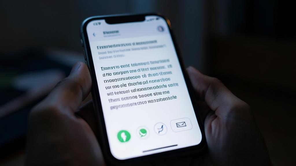
Warning: official social widgets can track your visitors and slow down your site. A little-known but important aspect of sharing buttons: not all are equal, and some pose real problems. The “official” sharing buttons offered by major platforms (the widgets to integrate provided by social networks) load CODE from these platforms on your page; however, this code can TRACK your visitors: track them, collect data on their browsing, EVEN if they never click the button, simply because the widget is present; this is like letting these platforms monitor your visitors on your own site. Consequences: a PRIVACY issue (your visitors are tracked without their knowledge) and a COMPLIANCE issue (this tracking requires consent, like cookies—our guides on managing the cookie banner); not to mention that these heavy widgets SLOW DOWN your site (external scripts to load). The solution: favor LIGHT and PRIVACY-RESPECTING sharing buttons—simple sharing links that only activate the network when the visitor CLICKS, without passive tracking or third-party code loading in the background; many modules and extensions offer this type of non-tracking buttons; it’s better for your visitors, your compliance, AND your site’s speed. Other pitfalls to avoid: TOO MANY buttons (an exhaustive collection that weighs down and discourages); forcing sharing (aggressive pop-ups, heavy incentives “share to continue reading”: this annoys and backfires); forgetting the share preview (a shared link without a nice image or clear title is less attractive: take care of your sharing metadata); broken or untested buttons (check they work on desktop and mobile); and UNREALISTIC expectations (buttons facilitate sharing but don’t create it: most visitors don’t share, and that’s normal; only good content makes people want to share). Finally, don’t display SHARE COUNTERS if the numbers are low: a “0 shares” or “2 shares” display does more harm than good (negative social proof effect); it’s better to have no counter than a disappointing one. By choosing light and non-tracking buttons, staying subtle and realistic, and taking care of the share preview, you get the advantage of sharing buttons (extended reach) without their drawbacks (tracking, slowness, annoyance).

Frequently asked questions
Are sharing buttons really useful?
Useful, yes, but on the condition of understanding what they do—and don’t do. Their usefulness: they FACILITATE sharing of your content by your visitors, turning your readers into relays who introduce you to their entourage; it’s a simple and free way to extend your reach, valuable as content recommended by a close contact inspires great trust. BUT they’re just a FACILITATOR: they don’t CREATE the desire to share, they only make it easier to act on. The reality: the vast majority of visitors DON’T share, even with well-placed buttons; those who do share because the CONTENT is worth it (useful, interesting, inspiring). So the effectiveness of buttons depends first on the QUALITY of what you publish: on bland content, no button will trigger shares; on excellent content, buttons turn the desire to share into actual shares. In summary: yes, sharing buttons are useful (low-cost, they capture shares from those who want to), but don’t overestimate their impact and don’t be disappointed by few shares (it’s normal). Add them to content worth sharing (articles, valuable content), choose a few relevant buttons (including messaging apps), and focus your energy on content quality—that’s the real driver of sharing. Buttons are a good complement, not a magic formula.
Should you include all social networks?
No, especially not: this is a common and counterproductive mistake. Piling up all possible social networks “just in case” creates a visually heavy row of icons, slows down the page, and, paradoxically, DISCOURAGES sharing (too many choices paralyze; and unused networks look neglected). Do the opposite: select A FEW truly RELEVANT buttons for YOUR audience. How to choose? Ask yourself where your audience is really present and where they usually share; no need to offer a network your visitors don’t use. Crucial point often overlooked: think of MESSAGING APPS (like WhatsApp); today, most sharing happens in PRIVATE, person-to-person, via messaging, far more than publicly on networks; a messaging sharing button (especially on mobile) is therefore often MORE useful than a button to a large social network. Another good approach on mobile: triggering the phone’s NATIVE SHARE function (the system’s “Share” button that opens all the user’s apps), letting everyone choose their channel. In summary: don’t include ALL networks; choose a few relevant ones for your audience, without forgetting messaging apps, and favor native sharing on mobile. A few well-chosen buttons are more effective, lighter, and more elegant than an exhaustive collection most of which serve no one. When it comes to sharing buttons, sobriety and relevance always beat exhaustiveness.

Do sharing buttons raise privacy concerns?
It depends on the TYPE of buttons: some yes, others no. The “official” sharing buttons of major platforms (the widgets provided by social networks) load code from these platforms on your page; this code can TRACK your visitors—collect data on them EVEN if they never click the button, simply because the widget is present; this is a real privacy issue (your visitors are tracked without their knowledge by these platforms, on your own site) and a compliance issue (this tracking requires consent, like cookies—our guides on managing the cookie banner); these widgets also slow down your site. The good solution: use LIGHT and PRIVACY-RESPECTING sharing buttons—simple sharing links that only activate the network when the visitor CLICKS, without passive tracking or third-party code loading in the background; many modules and extensions offer this type of “non-tracking” buttons; they fulfill the same function (allowing sharing) without the drawbacks. By choosing these non-tracking buttons, you avoid the privacy issue: nothing is loaded or collected until the visitor actively decides to share. It’s better for your visitors (respect for their privacy), for your compliance (less consent to manage), and for your site’s speed. So: yes, sharing buttons CAN raise privacy concerns if they’re the tracking official widgets; no, if you use light non-tracking buttons; favor the latter, it’s a simple and beneficial choice on all fronts.
Key takeaways
Social sharing buttons allow your visitors to SHARE your content with their entourage in one click, turning your readers into relays: it’s a simple and free way to extend your reach, valuable as content recommended by a close contact inspires great trust. BUT they’re just a FACILITATOR: they don’t create the desire to share, they only make it easy to act on; their effectiveness depends first on the QUALITY of your content (on bland content, no button will trigger shares). To CHOOSE and PLACE them well: don’t include ALL networks (too many weigh down and discourage); select a few RELEVANT networks for your audience, without forgetting MESSAGING APPS (WhatsApp…); most sharing happens privately, person-to-person, often more powerful than public sharing; place them in visible but non-intrusive locations (end of article especially, where the reader is most likely to share); stay subtle; optimize for MOBILE (where most sharing happens) and favor the phone’s native sharing. ESSENTIAL PRECAUTIONS: beware of official platform widgets, which TRACK your visitors (even without a click) and SLOW DOWN the site—prefer LIGHT and NON-TRACKING buttons (simple links only activating the network on click), better for privacy, compliance, and performance; take care of the SHARE PREVIEW (image, title, description) so your shared links are attractive; don’t FORCE sharing (no aggressive pop-ups); stay REALISTIC (most don’t share, it’s normal); test that everything works; and avoid displaying counters if the numbers are low. Don’t confuse SHARING buttons (spreading your content) and “Follow us” buttons (subscribing to your accounts). Well used—few relevant, light, and non-tracking buttons, well placed, with a nice share preview—they extend your reach without harming your visitors’ privacy or your site’s speed. But remember: the real driver of sharing remains the quality of what you publish; buttons only open the door to those who already want to share.

Your business deserves a real online presence: showcase site, store, SEO—we create the site that reflects you.
Leave a Reply
You must be logged in to post a comment.