
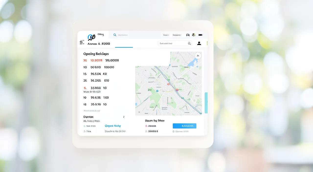
A WIDGET on a website is a small module that adds a feature to a page: a contact form, a map, a call button, a clock, weather, a social network feed, a chat, customer reviews… Well-chosen widgets make your site more useful and practical for your visitors: they provide information or an action in the right place. But poorly chosen or too many widgets clutter, slow down, and distract. The key is not to add as many as possible, but to add only widgets that are TRULY USEFUL to your visitors. Let’s see what a widget is, how to choose those that bring real value, and the precautions to take (performance, security).
What is a widget and what is it for
Let’s understand what a widget is and its purpose. A small MODULE: a widget adds a function/content to a page (a practical block); a functional brick; the principle; simple. Provide a FUNCTION: contact, map, call, chat, reviews, social network; the widget provides a specific service; useful; concrete. Facilitate an ACTION: a widget can allow you to act (contact, book, call); take action; effective; useful. Display INFO: opening hours, map, weather, news; inform on the page; practical; useful. Common EXAMPLES: contact form, access map, mobile call button, customer reviews, social network feed, chat; frequent widgets; varied; useful. Make the site more PRACTICAL: the right widget provides what the visitor needs; improve the experience; useful; important. EASY to add: website tools offer widgets to insert; often without coding; accessible; practical. In the RIGHT place: a useful widget placed where it serves; context matters; relevant; useful. Not too many, nor POORLY chosen: the key is relevance, not quantity; only useful widgets; discernment (we’ll come back to this); important. A COMPLEMENT: widgets complement your content, they don’t replace it; a functional plus; to be balanced; nuance. In summary, a WIDGET is a small MODULE that adds a feature or content to a page on your site: a practical brick. It can provide a specific FUNCTION (contact form, access map, call button, chat, customer reviews, social network feed…), facilitate an ACTION (contact, book, call directly), or display INFORMATION (opening hours, map, weather, news). Common widgets are varied and useful: contact form, access map, mobile call button, customer reviews, chat, social networks. Well used, they make your site more PRACTICAL by providing the visitor with what they need, in the right place—and they are usually EASY to add (website tools offer them to insert, often without coding). But the essential thing to understand: the key is not QUANTITY, but RELEVANCE. A widget is an asset only if it is TRULY USEFUL to your visitors and well placed; too many widgets, or poorly chosen widgets, clutter more than they help. Widgets are a COMPLEMENT to your content, to be balanced with discernment. Let’s see how to choose the right ones.
A widget is like a small tool on your website that helps visitors do something useful, like contacting you or finding your location. The best widgets are the ones that actually help people – not just the ones that look pretty. Too many widgets can make your site slow and confusing, so you should only add the ones that really make a difference.
A restaurant website might use a booking widget that lets customers reserve tables directly. This is much more useful than a decorative clock widget that just shows the time but doesn’t help visitors do anything important.
How to choose truly useful widgets
Here’s how to select widgets that bring real value; follow these principles. Start with the VISITOR’S needs: which widget really helps your visitor? start with their need; usefulness first; essential. ESSENTIAL widgets: contact, access map, call button (mobile); the most useful in general; priorities; useful. According to your ACTIVITY: a restaurant → booking, a location → map, a service → contact; adapt to your needs; relevant; useful. Each widget must SERVE: only add what brings real value; no gadgets for “looking good”; useful only; important. Avoid GADGETS: clock, animations, useless decorative widgets; they clutter without serving; avoid the superfluous; advice. Don’t OVERLOAD: a few useful widgets are better than an avalanche; sobriety; don’t clutter; important. The right PLACEMENT: place the widget where it serves (contact near the bottom, map on the access page); context; relevant; useful. PERFORMANCE: some widgets slow down the site; weigh usefulness vs. weight; technical; important (we’ll come back to this). RELIABILITY: choose serious, reputable widgets; reliable and safe; cautious; useful. TEST the effect: does a widget really help? if not, remove it; evaluate; adjust; advice. In summary, to choose truly useful widgets, always start with the VISITOR’S needs: which widget HELPS them? Their usefulness must take priority over everything else. Essential widgets, useful to most sites, are: the CONTACT form, the ACCESS map (if you have a location), the CALL button on mobile. Then, adapt to YOUR activity: a restaurant benefits from a booking widget, a local business from a map, a service from a contact form or chat. The golden rule: each widget must SERVE—only add what brings REAL value, and avoid useless decorative GADGETS (clock, animations, widgets “to look good” that clutter without helping). Don’t OVERLOAD: a few useful widgets are better than an avalanche that weighs down and distracts. Take care of the PLACEMENT (each widget where it serves: contact accessible, map on the access page), monitor PERFORMANCE (some widgets slow down the site: weigh their usefulness against their weight), and RELIABILITY (choose serious and safe widgets). Finally, TEST the effect: if a widget doesn’t really help your visitors, remove it. In summary, the right widget is one that meets a real need of your visitor, well placed, without weighing down the site: relevance and sobriety, not accumulation.
The golden rule of widgets: only add what really helps your visitors—relevance takes precedence over quantity. The temptation with widgets is to add many of them (“while we’re at it”) to make your site “rich.” This is a mistake: the true quality of a site is not measured by the number of widgets, but by their USEFULNESS. Here’s how to choose well. The fundamental principle: each widget must meet a REAL NEED of your visitors. Before adding a widget, ask yourself one question: “Does this REALLY help my visitor?” If yes (it provides information they’re looking for, or allows a useful action), add it. If it’s just “pretty,” “trendy,” or “because it’s possible,” refrain. This simple question avoids the accumulation of useless widgets. Widgets that really help (the most frequent and useful ones): the CONTACT FORM (allowing you to be reached easily: almost indispensable), the ACCESS map/plan (if you have a physical location: helps visitors find you), the CALL button on mobile (in one click, call from a phone: very practical), CUSTOMER REVIEWS (proof of trust), a CHAT or messaging button (quick contact, if you can respond), a BOOKING or appointment widget (for relevant activities: restaurant, hairdresser, practitioner). These widgets bring real value because they meet concrete needs of visitors: contacting you, finding you, trusting you, booking. Adapt them to YOUR activity: not all are relevant for everyone. Widgets to avoid (gadgets): clock, decorative calendar, visitor counter, animations, “fun” widgets without real function, or anything that brings nothing to the visitor. These elements CLUTTER the page, DISTRACT from the essential, SLOW DOWN the site, and sometimes look “amateur” or outdated. A streamlined site with a few useful widgets looks far more professional than a site overloaded with gadgets. The principle of SOBRIETY: less, but better. A few truly useful widgets, well chosen and well placed, are infinitely better than an avalanche of modules. Each extra widget dilutes attention, weighs down the site, and complicates the page. Prioritize clarity and sobriety. The right PLACEMENT: a useful widget only helps if it’s in the right place—the contact form accessible (often at the bottom of the page or on the contact page), the map on the access or contact page, the call button clearly visible on mobile, the reviews near the offers. Place each widget where the visitor needs it, in the relevant context. In summary, the golden rule of widgets: only add WHAT HELPS your visitors (ask yourself “is this useful to my visitor?” before each addition), prioritize widgets that meet real needs (contact, map, call, reviews, booking—adapted to your activity), avoid useless decorative GADGETS (clock, counters, animations: they clutter and slow down), respect SOBRIETY (less, but better: a few useful widgets well placed are better than an avalanche), and take care of the PLACEMENT (each widget where it serves). Relevance and sobriety, never accumulation: this is how widgets make your site more useful without cluttering it.

Useful widgets according to your activity
The relevant widgets vary according to your activity; here are some adapted examples. CONTACT (for everyone): contact form; allow you to be reached; almost universal; essential. ACCESS map: if you have a location; help visitors find you; useful for businesses/locations; relevant. Mobile CALL button: call in one click from a phone; practical for services; useful; advice. BOOKING/appointment: restaurant, hairdresser, practitioner; book directly; very useful for these activities; important. CUSTOMER reviews: proof of trust; reassure visitors; powerful; useful. CHAT/messaging: quick contact (if you can respond); exchange easily; useful; advice. Social network FEED: show your activity on social networks; animate, prove; option; useful. NEWSLETTER: collect subscribers; keep in touch; useful if relevant; option. GALLERY/before-after: show your work; prove your expertise; useful for visuals; relevant. CART/shop: if you sell; allow purchase; essential for e-commerce; important. In summary, the relevant widgets depend on your activity: the CONTACT form is useful to almost everyone (allow you to be reached: almost universal). If you have a PHYSICAL location, the ACCESS map helps visitors find you (useful for businesses and locations), and the mobile CALL button allows you to be called in one click (practical for services). For appointment-based activities (restaurant, hairdresser, practitioner), a BOOKING widget is very useful. Customer reviews reassure (proof of trust, powerful everywhere), a CHAT or messaging facilitates quick contact (if you can respond), and a social network FEED can animate your site and show your activity. According to your needs: a NEWSLETTER widget (to collect subscribers and keep in touch), a GALLERY or before/after (to prove your expertise, useful for visual activities), or a CART/shop (essential if you sell online). The principle remains the same: choose widgets ADAPTED to YOUR activity and to the needs of YOUR visitors—a restaurant doesn’t have the same needs as a consultant or a store. Only add those that bring real value in your case, and leave aside those that don’t serve your activity. Relevance to YOUR context is the key to a successful widget choice.
Warning: too many widgets slow down and clutter, beware of dubious third-party widgets (security, data), and check that they work. Widgets are practical, but if poorly managed, they can harm your site. Here are the points to watch. First point: TOO MANY widgets SLOW DOWN and CLUTTER your site. Each widget adds weight and complexity to your page: multiplying widgets can SLOW DOWN loading (or a slow site scares visitors and harms SEO), OVERLOAD the page visually (the visitor doesn’t know where to look, the essential is drowned), and DISTRACT from what really matters. Some widgets (maps, social network feeds, chats, animations) are particularly HEAVY. The rule: always weigh the USEFULNESS of a widget against its COST (weight, clutter); only keep the really useful ones, and monitor your site’s speed. A fast and streamlined site is better than a site full of widgets that lags. Second point, important: beware of DUBIOUS THIRD-PARTY widgets (security and personal data). Many widgets come from THIRD-PARTY services (external to your site): by integrating them, you give them a place on your site, and they can access information about your visitors. The risks: a poorly secured or malicious widget can pose a SECURITY problem (vulnerability, unwanted code), and a third-party widget can COLLECT data about your visitors (tracking), which raises privacy and compliance issues. Therefore, prioritize RELIABLE and REPUTABLE widgets (from serious and recognized services), beware of obscure or free widgets of dubious origin, and be attentive to what they do with your visitors’ data. Don’t install just any widget “found somewhere.” Third point: think about PERSONAL DATA and compliance. Widgets that collect data (forms, chats, tracking, social networks) imply obligations: inform your visitors, respect data protection rules, manage consent if necessary (especially for tracking). Make sure your widgets are compliant, and inform yourself about your obligations. Fourth point: CHECK that your widgets WORK (and stay up to date). A broken widget, that doesn’t display, or that shows an error, looks bad and frustrates the visitor: test each widget after adding it (does it display? does it work? on mobile too?), and periodically check that they still work (a third-party widget may stop working if the service changes). A contact widget that doesn’t send messages, a map that doesn’t display: so many silent losses. Fifth point: check the display on MOBILE. Some widgets display poorly or are disruptive on mobile (where many visitors arrive): check that each widget displays correctly and doesn’t disrupt mobile navigation. Sixth point: if you’re not comfortable technically, HAVE YOURSELF HELPED to properly and securely integrate widgets (the person who manages your site). In summary: TOO MANY widgets SLOW DOWN and clutter (weigh usefulness against weight; keep only a few really useful widgets; monitor speed), beware of DUBIOUS THIRD-PARTY widgets (security, data collection: prioritize reliable and reputable services, beware of the obscure), think about DATA COMPLIANCE (information, consent for tracking), CHECK that your widgets work and stay up to date (test, check periodically), and check MOBILE display. With these precautions, widgets usefully enrich your site; poorly managed, they slow it down, clutter it, or expose you. Sobriety, reliability, and verification are the keys.
Frequently asked questions
How many widgets should you put on your site?
As few as possible, keeping only the useful ones: a few well-chosen widgets (contact, map, call according to your activity) are better than a multitude; each extra widget slows down and clutters; prioritize relevance over quantity. Let’s see. THE LEAST POSSIBLE of useless ones: only keep the really useful widgets; no magic number, but sobriety; quality, not quantity; principle. A few USEFUL ones are enough: contact, map, call, reviews (depending on your case); the essential well chosen; few but relevant; advice. Each EXTRA widget costs: slows down, clutters, distracts; accumulation harms; don’t overload; important. RELEVANCE comes first: better 3 useful widgets than 15 gadgets; usefulness, not quantity; target; essential. According to your ACTIVITY: the right number depends on your real needs; an e-commerce site will have more than a simple showcase; adapt; logic. ELEGANT SOBRIETY: a streamlined site looks more professional than an overloaded site; streamlined is appealing; take care; advice. PERFORMANCE at stake: fewer widgets = faster site; sobriety serves speed; double benefit; clever. Each widget MUST serve: keep the principle “useful or nothing”; question each addition; discernment; important. REMOVE the useless: remove widgets that don’t serve; lighten; maintain; wise. The ADVICE: as few as possible, keeping only the useful ones; a few well-chosen widgets (contact, map, call according to your activity) are better than a multitude; each extra widget slows down and clutters; relevance, not quantity. In summary, there’s no magic number of widgets, but a clear principle: AS FEW AS POSSIBLE, keeping only the USEFUL. The right approach is that of SOBRIETY: a few really useful widgets, well chosen and adapted to your activity (for example a contact form, an access map if you have a location, a call button on mobile, possibly customer reviews), are infinitely better than a MULTITUDE of widgets. Why this sobriety? Because each EXTRA widget has a COST: it SLOWS DOWN the site (or speed is crucial: a slow site scares visitors), it CLUTTERS the page visually (the visitor doesn’t know where to look, the essential is drowned), and it DISTRACTS from what really matters. An overloaded site with widgets looks less professional, not more: the STREAMLINED appeals more than accumulation. The rule to apply to each widget: “is it really useful to my visitors?” If yes, keep it; if it’s a decorative gadget or “to look good,” remove it. The right NUMBER also depends on your ACTIVITY: an e-commerce site will legitimately have more functional widgets (cart, reviews, search…) than a simple showcase (which can do with a contact and a map). Adapt to your real needs, without adding “while we’re at it.” An additional benefit of sobriety: fewer widgets make your site faster, which improves the experience and SEO—sobriety therefore serves both clarity and performance. Finally, think about REMOVING widgets that no longer serve (or are no longer useful): lighten regularly. In summary: keep few widgets, but useful; question each addition (“useful or nothing”); adapt to your activity; and always prioritize relevance and sobriety over quantity. This is how widgets make your site more practical without weighing it down.
The best websites use just a few widgets – the ones that actually help visitors. Too many widgets make your site slow and confusing. Think about what your visitors really need, and only add those widgets. A contact form, map, or call button are usually the most helpful.
A small local bakery might only need a contact form and a map widget. Adding a fancy weather widget or animated clock wouldn’t help customers find or contact them, so it would just slow the site down.
Do widgets really slow down a site?
Yes, some can: each widget adds weight, and some (maps, social network feeds, chats, animations) are particularly heavy; multiplying widgets can slow down your site, which scares visitors—hence the importance of keeping only the useful ones. Let’s see. YES, some slow down: each widget adds weight/code to the page; multiplying can slow down; a real effect; to know. Particularly HEAVY ones: maps, social network feeds, chats, animations, videos; these widgets weigh a lot; beware of them; important. A SLOW site scares visitors: visitors don’t wait for a slow site; they leave; speed is crucial; at stake. SEO is affected: a slow site is penalized in search rankings; double impact; take care of speed; important. Weigh USEFULNESS vs. weight: for each widget, does the usefulness justify the weight? decide thus; arbitrate; advice. Only keep the USEFUL: fewer widgets = faster site; sobriety pays; lighten; clever. Well-made widgets: some widgets are optimized (not heavy); choose the right ones; quality; useful. MONITOR speed: test your site’s speed (before/after adding); measure the impact; cautious; useful. REMOVE heavy useless ones: if a heavy widget doesn’t really serve, remove it; lighten; arbitrate; wise. The ADVICE: yes, some widgets slow down (especially maps, social networks, chats, animations); each widget adds weight, and a slow site scares visitors and harms SEO; only keep the useful, choose optimized widgets, and monitor speed. In summary, yes, widgets CAN really slow down a site—and this is an important point to know. The reason: each widget adds WEIGHT and code to your page, which must load. A single light widget has little impact, but MULTIPLYING widgets gradually weighs down the site, until it slows down noticeably. Some widgets are particularly HEAVY: interactive maps, social network feeds (which load a lot of external content), chats, animations, embedded videos. These widgets, if numerous or poorly optimized, can really slow down your site. Or speed is CRUCIAL: a SLOW site SCARES visitors (they don’t wait for a page to load: a few seconds too long, and they leave), and it is PENALIZED in SEO (search engines favor fast sites). A site slowed down by too many widgets can therefore cost you visitors and visibility. The practical conclusion: always weigh the USEFULNESS of a widget against its WEIGHT. For each widget, ask yourself: does its usefulness justify the slowdown it causes? Only keep the really USEFUL widgets (fewer widgets = faster site: sobriety directly serves performance), and among them, prioritize well-made and OPTIMIZED widgets (some are light, others heavy: the choice matters). Monitor your site’s SPEED (you can test it before and after adding a widget to measure its impact), and if a HEAVY widget doesn’t provide an essential service, REMOVE it without hesitation. If you’re not sure, have yourself helped to optimize. In summary: yes, widgets (especially the heavy ones: maps, social networks, chats) can slow down your site, which scares visitors and harms SEO; the solution is sobriety—only keep the useful widgets, choose them optimized, and monitor speed. A fast and streamlined site is always better than a site full of widgets that lags.
How to add a widget securely?
RELIABLE widgets: choose widgets from serious and recognized services; reputation is a guarantee; avoid the obscure; cautious. Beware of DUBIOUS ones: an obscure/free widget of unknown origin can cause problems (security, data); don’t install it; vigilance; important. CHECK the data: see what the widget does with your visitors’ data (collection, tracking); compliance; cautious; important. Via your WEBSITE tool: install widgets through the means provided by your tool; safer than unknown code; clean; advice. Avoid UNKNOWN code: don’t paste widget code from a dubious source (risk); third-party code can be malicious; caution; important. TEST after adding: check that the widget works (and on mobile); ensure everything is fine; cautious; useful. COMPLIANCE: for widgets that collect (form, chat, tracking), respect data rules; inform, manage consent; serious; important. KEEP UPDATED: keep your widgets/extensions up to date (security); an outdated widget may have vulnerabilities; maintain; useful. HAVE YOURSELF HELPED: if in doubt, the person who manages your site installs it properly; don’t tinker with the important; wise. The ADVICE: choose reliable and reputable widgets (serious services), check what they do with data, install them via your website tool (not dubious code), test that they work, respect data compliance, keep them updated, and have yourself helped if in doubt; beware of the obscure. In summary, adding a widget securely relies on a few simple but important precautions, because a widget is often a THIRD-PARTY (external) element that takes place on your site. First reflex: choose RELIABLE and REPUTABLE widgets, from SERIOUS and recognized services. The reputation of a service is a guarantee of security and seriousness. On the other hand, BEWARE of OBSCURE widgets, free, of unknown or dubious origin: they can cause SECURITY problems (unwanted code, vulnerability) or poorly manage your visitors’ DATA. Don’t install just any widget “found somewhere.” Second precaution: CHECK what the widget does with your visitors’ DATA. Many third-party widgets can collect information (tracking, personal data): inform yourself about their practices, and for widgets that collect data (forms, chats, tracking), respect COMPLIANCE (inform your visitors, manage the necessary consent, especially for tracking). Third precaution: install widgets via the MEANS PROVIDED by your website tool (the official widgets or extensions of your platform), rather than pasting THIRD-PARTY code from a dubious source (unknown code inserted into your site can be malicious: this is a real security risk). Using the proper channels of your tool is safer. Fourth precaution: TEST the widget after adding it—check that it works correctly (does it display? does it work? on mobile too?), and keep your widgets and extensions UPDATED (an outdated widget may have security vulnerabilities). Fifth precaution: if in DOUBT or if you’re not comfortable technically, HAVE YOURSELF HELPED by the person who manages your site—better a clean and secure installation than risky tinkering. In summary: to add a widget securely, prioritize reliable and reputable widgets (beware of the obscure), check what they do with your visitors’ data (compliance, information, consent), install them via your website tool rather than dubious code, test that they work, keep them updated, and have yourself helped if needed. These precautions allow you to enrich your site with useful widgets without compromising its security or your visitors’ privacy.
What to remember
A WIDGET is a small module that adds a feature or content to a page on your site: contact form, access map, call button, customer reviews, chat, booking, social network feed… Well chosen, widgets make your site more USEFUL and practical for your visitors, by providing information or an action in the right place. But the essential thing to understand: the key is NOT quantity, but RELEVANCE. The golden rule: only add what REALLY HELPS your visitors. Before each widget, ask yourself the question “is this useful to my visitor?”—if yes, keep it; if it’s a decorative gadget or “to look good,” refrain. Widgets that really help meet concrete needs: CONTACTING you (form, almost indispensable), FINDING you (access map if you have a location), CALLING you in one click (mobile call button), TRUSTING you (customer reviews), BOOKING (for restaurant, hairdresser, practitioner)—adapt them to YOUR activity. Avoid GADGETS (clock, counters, animations without function), which clutter and slow down. Respect SOBRIETY: a few useful widgets, well chosen and well placed (each where it serves), are infinitely better than an avalanche—a streamlined site looks more professional than an overloaded site. But respect the points of vigilance. TOO MANY widgets SLOW DOWN the site (especially the heavy ones: maps, social networks, chats, animations): or a slow site scares visitors and harms SEO—always weigh usefulness against weight, only keep the useful, choose optimized widgets, and monitor speed (sobriety therefore serves both clarity and performance). Beware of DUBIOUS THIRD-PARTY widgets: a widget is often an external element that takes place on your site—prioritize RELIABLE and reputable services, beware of the obscure (security and data collection risks), install them via the proper means of your tool rather than dubious code, and check what they do with your visitors’ data (compliance: information, consent for tracking). Finally, CHECK that your widgets work (test after adding, check periodically, check on mobile) and keep them updated; have yourself helped if in doubt. In short, widgets are an excellent way to make your site more useful and practical—provided you only choose those that bring real value to your visitors, adapted to your activity, without weighing it down or cluttering it, and while taking care of performance, security, and compliance. Relevance and sobriety, never accumulation: this is how a widget becomes a real asset rather than a burden.


Your activity deserves a real online presence: showcase site, store, SEO—we create the site that suits you.
Leave a Reply
You must be logged in to post a comment.