
It is rarely noticed when it’s good, but it jumps out when it’s bad: typography, i.e., the choice and arrangement of fonts, plays a huge role in the appearance and readability of a website. Well-crafted typography conveys professionalism and makes reading pleasant; neglected typography betrays amateurism. This guide gives you the keys to choosing your fonts well, without being a graphic designer.
Typography, a choice that matters
Text occupies most of a website, and the way it is presented influences the entire perception. Good typography facilitates reading, hierarchizes information, and conveys a personality—serious, modern, warm. This seemingly secondary choice strongly contributes to the overall impression. Two sites with identical content can give a radically different impression depending on their typographic treatment.

Basic principles
- Readability first and foremost: a clear font, at a comfortable size.
- Sobriety: one or two fonts are enough, no more.
- Hierarchy: clearly distinguish titles from body text.
- Spacing: a well-spaced text reads much better than a cramped one.
The right reflex. Limit yourself to one or two fonts across your entire site: one for titles, one for body text. Multiplying fonts creates a sense of disorder and amateurism. Typographic consistency is one of the secrets of a professional-looking site.
Choosing readable fonts
The absolute priority is readability. A creative but hard-to-read font undermines your content. Favor clear, proven fonts for body text, reserving any whimsy for titles, sparingly. Also ensure a comfortable text size: too small text tires and drives away readers. Your visitors’ reading comfort should always take precedence over aesthetic effect.

The importance of spacing
A often overlooked but decisive factor: spacing. A well-spaced text—with margins, sufficient line height, and well-separated paragraphs—reads effortlessly. A cramped text, stuck to the edges, with tight lines, discourages reading, even with a beautiful font. Letting the text breathe is one of the simplest and most effective ways to improve the appearance and comfort of your site.
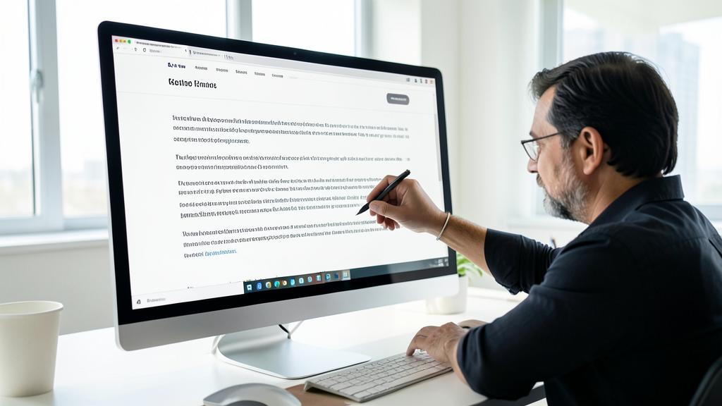
Avoid this. Don’t give in to the temptation of overly creative or decorative fonts for body text: what seems “pretty” from afar quickly becomes tedious to read in a full paragraph. Reserve creativity for titles, and keep a simple, readable font for everything that really needs to be read.

Good typography makes your website easier to read and more professional. It’s not about fancy fonts, but about clear, well-spaced text that doesn’t strain the eyes.
A news site using a 16px font size with 1.5 line height and 70 characters per line will be much easier to read than one with 12px text, tight spacing, and 100 characters per line. The first site will keep readers longer.
Putting it into practice: setting your typography in five decisions
In practice, on your site: 1. Base size: 16 pixels minimum for body text—below that, you’re making your visitors’ eyes work. 2. Line length: 60 to 80 characters per line—beyond that, the eye gets lost at the end of the line; this is the most overlooked and one of the most important settings. 3. Line height: about 1.5 times the text size—the spacing that makes all the difference. 4. Contrast: dark text on a light background (or vice versa), never light gray on white. 5. Hierarchy: clearly distinct titles (size, weight) that allow scanning the page. These five settings, applied once in your theme, immediately improve the readability of the entire site.
Frequently asked questions
How many fonts should I use?
One or two are enough: one for titles, one for body text. Beyond that, the risk of visual clutter increases significantly. Sobriety is a sign of professionalism.

Should I use special fonts?
No: many high-quality, free, and readable fonts exist. The important thing is not the rarity of the font, but the readability and coherence of the whole.
Do fonts affect the site’s speed?
Yes: each loaded font adds weight. Limit yourself to two families and only the weights actually used, and favor modern, optimized formats. Typographic sobriety also serves performance—everything aligns.

What to remember
Typography, though rarely noticed, shapes the appearance and readability of your site. Its principles are simple: prioritize readability, limit yourself to one or two fonts, clearly hierarchize titles and text, and above all, generously space out the text. Choose clear, proven fonts for the body, reserve creativity for titles sparingly, and let the text breathe. These common-sense rules, accessible to all, are enough to take your site from amateurism to professionalism, for the greatest comfort of your readers.


Want a professional design for your site?
Leave a Reply
You must be logged in to post a comment.