
The contact form is often the only bridge between an interested visitor and you. Yet, many sites neglect it: endless form, useless fields, barely visible button — and the prospect abandons. A good, simple, and reassuring contact form turns a curious visitor into a real contact. This guide explains how to design a form that makes people want to write to you, rather than closing the page.
An underestimated challenge
You take care of your site, your texts, your images… and you rush the contact form. That’s a mistake, because that’s exactly where the conversion happens: turning interest into action. A visitor ready to contact you is a valuable prospect; losing them because of a cumbersome form is a waste. Consider this form as a major commercial touchpoint, not just a technical detail.

Simplicity above all
The golden rule is simplicity. Each additional field reduces the completion rate. Only ask for the essentials: usually a name, a way to get back in touch (email), and the message. Resist the temptation to ask for everything “just in case”: a short, quick-to-fill form converts much better than a discouraging questionnaire. You can always ask for more details during the follow-up exchange.
The right reflex. Only ask for the information you actually need to get back to the person. Each field removed increases your chances of being contacted. A mandatory phone number or a long list of questions scare people away: stick to the essentials.

The fewer fields you have, the more people will fill out the form. Keep it short and easy, and you’ll get more messages.
A freelance designer reduced their form from 7 fields to 3 (name, email, message). Their conversion rate jumped from 12% to 28% in a month.
Reassuring the visitor
Filling out a form means sharing personal details: the visitor needs reassurance. Clearly state what you’ll do with their information, specify your response time, and display other contact methods for those who prefer them. A form perceived as serious and respectful of privacy inspires confidence. This reassurance, often overlooked, makes all the difference when clicking “Send.”
Improving the experience
A few details significantly improve the experience: a clearly visible and accessible form, a clear submit button, a reassuring confirmation after sending (so the visitor knows their message went through), and good mobile display. A form that “works” smoothly, confirms receipt, leaves a professional impression, and builds trust for future interactions.
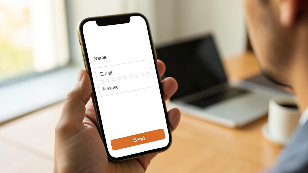

Don’t neglect this. Regularly check that your form works and that you’re receiving messages: a broken form or messages landing in spam make you lose contacts without even realizing it. Test it yourself from time to time—it’s a lifesaver.
After submission: the details that seal the deal
The submitted form is only half the journey—the follow-up makes the difference. The confirmation page: Replace the dry “message sent” with a real thank you, a response time announcement (“we’ll get back to you within 24 business hours”), and a useful waiting suggestion (your portfolio, your FAQ). The automatic read receipt: An immediate email confirming receipt and summarizing the message—the contact knows it worked and has a record. The quick response: Replying within the following business hours multiplies your chances of closing the deal—the prospect who contacts you often reaches out to multiple professionals: the first to respond well is largely favored.

Frequently asked questions
What’s the maximum number of fields?
As few as possible: often three are enough (name, email, message). Each additional field reduces the response rate. Always prioritize simplicity.
Should there be anti-spam protection?
Yes, it’s useful to avoid unwanted messages, but choose a discreet protection that doesn’t bother real visitors.

Should other contact methods be offered besides the form?
Yes: some prefer direct email or phone. Display the alternatives near the form—everyone chooses their preferred channel, and you don’t lose any contact profiles. The form structures, the alternatives reassure.
Key takeaways
The contact form is a major conversion point, often overlooked. Its golden rule: simplicity—only ask for the essentials, as each removed field increases your chances of being contacted. Reassure the visitor about data usage and response time, refine the experience (visibility, confirmation, mobile), and regularly check that it works. A simple, clear, and reassuring form turns your visitors’ interest into real contacts: it’s one of the best investments for your site.


Is your site converting enough? Let’s assess it.
Leave a Reply
You must be logged in to post a comment.