
The DARK MODE — this version of an interface with a dark background and light text, rather than the opposite — has become very popular: many people use it on their phone, apps, and system, for eye comfort (especially in the evening), aesthetics, or battery savings on certain screens. Naturally, the question arises: should you offer a dark mode on your website? The idea may be appealing — modern, comfortable, appreciated by some visitors. But it’s not essential, it requires careful work to be done well, and a poorly executed dark mode can harm readability. Before diving in, it’s better to understand the advantages, constraints, and best practices. Let’s see what dark mode is, whether it’s worth it for your site, and how to offer it without degrading the experience.
Dark mode: what are we talking about?
Let’s understand what dark mode is and its appeal; let’s see. What it is: an interface with a DARK background and LIGHT text (the opposite of the classic light background, dark text); a « night » version; the principle; simple. Very POPULAR: many people use it on their phone, apps, system; widespread usage; a trend; to know. Eye COMFORT: some find it more restful, especially in the evening, in the dark; less light projected; a comfort argument; appreciated. AESTHETICS: dark mode is perceived as modern, elegant; a visual appeal; trendy; a plus. Battery ECONOMY: on some screens, dark mode consumes less; a slight technical advantage; secondary; to know. A personal PREFERENCE: some love it, others prefer the light mode; a matter of taste; variable; to respect. The system’s dark mode: many people enable dark mode at the device level; their apps follow; a possible expectation; to consider. On a WEBSITE: offering a website in dark mode (or an option to switch); responding to this preference; the question of the day; to weigh. Not ESSENTIAL: dark mode is a plus, not a necessity; a light site is perfect; don’t overestimate it; nuance. A choice to WEIGH: real advantages but constraints too; to evaluate according to your case (we’ll come back to it); discernment; important. In summary, DARK MODE is an interface with a DARK background and LIGHT text — the opposite of the classic light background and dark text, a kind of « night » version. It has become very POPULAR: many people use it on their phone, apps, and system, for several reasons: eye COMFORT (some find it more restful, especially in the evening or in the dark), AESTHETICS (it is perceived as modern and elegant), and sometimes a slight battery ECONOMY (on certain types of screens). It’s also a personal PREFERENCE: some love it, others prefer the light mode; it’s a matter of taste. Many people also enable dark mode at the DEVICE level, and sometimes expect their apps and websites to follow. Hence the question: should you offer a dark mode (or an option to switch) on your SITE? Remember one thing right away: dark mode is a PLUS, not a necessity — a light site is perfectly valid. It’s a choice to weigh according to your case, as it has real advantages but also constraints. Let’s see.
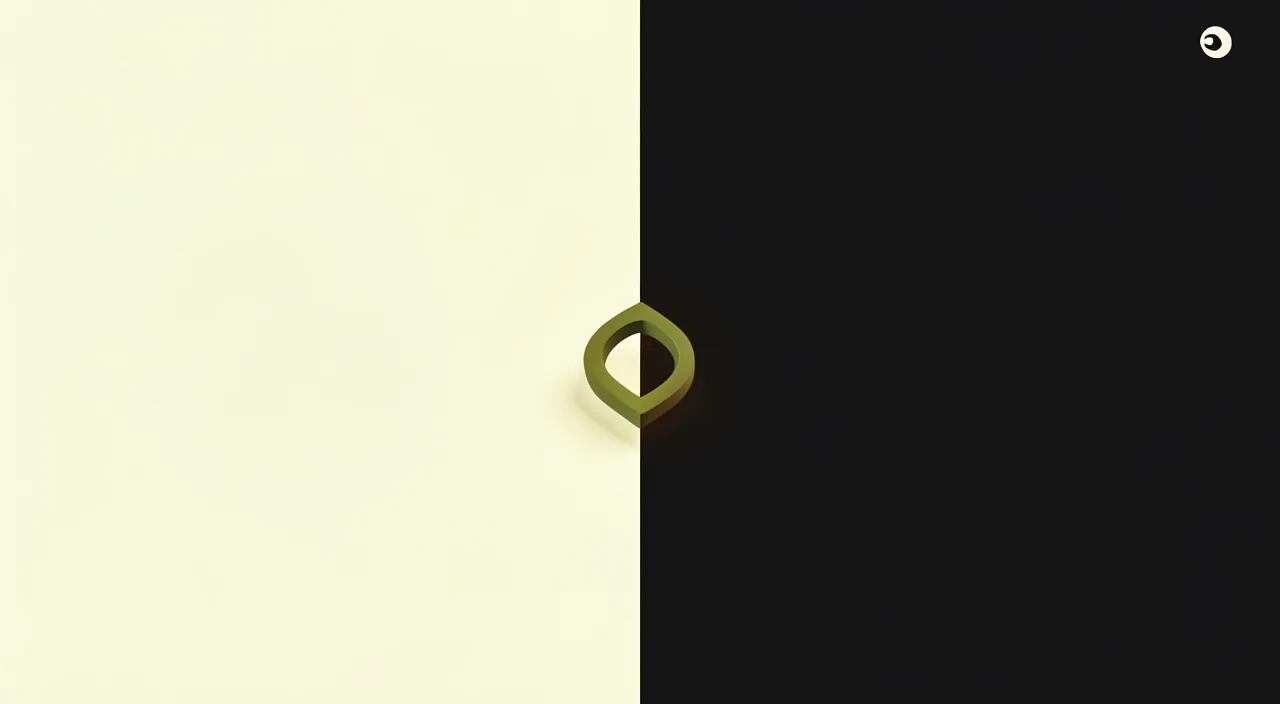
Dark mode is a setting that swaps light and dark colors on a screen. It’s popular because it can reduce eye strain in low light, looks sleek, and saves battery on some devices. But it’s not a must-have—it’s just a nice extra for some users.
Imagine a website like Reddit. It offers both light and dark modes. At night, a user might switch to dark mode to reduce eye strain, while during the day, they might prefer the default light mode for better readability in sunlight.
Should you offer a dark mode on your site?
Weighing the pros and cons helps decide; let’s see both sides. PROS — responding to a preference: some visitors appreciate dark mode; offering it satisfies them; a plus for them; useful. A MODERN image: offering dark mode can give a modern, polished image; following trends; valuable; a plus. The COMFORT offered: for those who prefer dark, a reading comfort; thoughtful; appreciated; useful. Following the SYSTEM: a site that respects the visitor’s device dark mode; a appreciated consistency; elegant; advice. CONS — not essential: most sites (in light mode) work very well; dark mode is not a necessity; don’t overestimate it; nuance. Careful WORK required: doing a dark mode well requires work (colors, images, contrast); it’s not trivial; a cost; to consider (we’ll come back to it). The risk of doing it POORLY: a poorly executed dark mode harms readability; worse than no dark mode; be careful; important. IMAGES to adapt: some images/logos look bad on a dark background; to manage; a constraint; to plan. Depending on your SITE: a simple site, a small showcase; dark mode is an optional luxury; a site where you read a lot; more relevant; adapt. Depending on your MEANS: if it’s easy to properly activate, why not; if it’s a big project, to weigh; according to the effort; pragmatic. The right QUESTION: do I need it, do my visitors want it, can I do it well? decide this way; discernment; sensible. In summary, should you offer a dark mode? Let’s weigh the pros and cons. PROS: it RESPONDS to the preference of some visitors (who appreciate dark mode; offering it satisfies them), gives a MODERN and polished image, offers COMFORT to those who prefer it, and allows you to FOLLOW the visitor’s device dark mode (a appreciated consistency). CONS: it’s NOT essential (most light mode sites work very well), it requires CAREFUL WORK to be done well (colors, images, contrast; it’s not trivial), a poorly executed dark mode HARMS readability (worse than no dark mode), and some IMAGES or logos look bad on a dark background (to adapt). The decision depends on YOUR site (for a simple small showcase, it’s an optional luxury; for a site where you read a lot, it’s more relevant) and your MEANS (if it’s easy to properly activate, why not; if it’s a big project, to weigh). The right questions to ask yourself: do I really need it? do my visitors ask for it? can I do it WELL? It’s a nice plus if done well, never an obligation.
The right reflex: dark mode is a plus, not an obligation — only offer it if you can do it properly, or let the site follow the visitor’s choice. Faced with the temptation of dark mode, keep a cool head: it’s a nice feature, but neither essential nor trivial to implement. Here’s how to approach the question intelligently. First, RELATIVIZE: dark mode is a PLUS, not a necessity. A well-designed and readable light mode site is perfectly valid and professional: the vast majority of sites work very well this way. Don’t feel obliged to offer a dark mode; it’s not a quality criterion in itself. The priority remains a clear, readable, and well-made site — in light mode first. Then, the ESSENTIAL RULE: if you offer a dark mode, do it PROPERLY, or don’t do it. A poorly executed dark mode is worse than no dark mode at all: unreadable text (insufficient contrast), images that clash on a black background, poorly adapted elements that « break »… This degrades the experience and makes it look neglected. Dark mode requires rethinking ALL colors (background, text, buttons, links), checking the CONTRAST everywhere (the text must remain well readable), and ADAPTING images and logos that look bad on a dark background. It’s a real labor of care. If you can’t devote this care to it, it’s better to abstain. A smart and simple approach: let the site FOLLOW the visitor’s choice. Rather than imposing a dark mode or adding a button, the most elegant solution (if your tool allows it easily) is to make your site RESPECT the visitor’s setting: if they have enabled dark mode on their device, your site displays in dark mode; otherwise, in light mode. Thus, each visitor finds their preference without doing anything, and you respect their choice — this is often the best way to handle dark mode, when it’s properly achievable. Another option: offer a BUTTON to switch between light and dark, letting the visitor choose. It’s good, but it requires taking care of BOTH versions (light AND dark), so more work. Some practical advice: start with a flawless light mode site (the base); only add dark mode if you can take care of it or if your tool handles it well on its own; carefully test the readability and display of images in both modes; and if it’s too much work for little benefit, give up without regret. Have the person who manages your site help you implement it properly. In summary: dark mode is a nice PLUS, not an obligation — a well-made light mode site is perfect. If you offer it, do it PROPERLY (colors, contrast, adapted images in both modes) or not at all, because a poorly executed dark mode harms readability. The most elegant solution, when it’s simple to implement, is to let your site FOLLOW the visitor’s choice (display dark if they have enabled dark mode on their device). Always prioritize a clear and readable site; add dark mode only if you can take care of it, or give up without complex: it’s just a bonus, never an essential criterion.
Successfully implementing a dark mode (if you offer one)
If you decide to offer a dark mode, here are the best practices; let’s follow them. A sufficient CONTRAST: the light text on a dark background must remain well readable; neither too pale nor blinding; readability first; essential. No PURE black/white: a very deep black with pure white is tiring; prefer a very dark gray background and light gray text; softer; advice. ADAPT the colors: review all colors (buttons, links, accents) for the dark background; consistency in both modes; take care; important. MANAGE the images: some images/logos clash on a dark background; adapt them (versions, borders); don’t neglect them; useful. Test the READABILITY: verify that everything is well readable in dark mode (texts, details); readability is the criterion; test; cautious. Take care of BOTH modes: if an option, light AND dark must be flawless; not one at the expense of the other; double care; advice. A light BUTTON to switch: if a button, it must be visible and understandable; the visitor finds the option; useful; practical. RESPECT the choice: remember the visitor’s preference (don’t force them); follow their choice; respectful; advice. Test on MOBILE: verify the rendering on mobile too; where many people browse; essential; important. Get HELP: to do it well, a pro or a good tool helps; don’t rush; wise; useful. In summary, if you decide to offer a dark mode, succeed by following these best practices: ensure a sufficient CONTRAST (the light text on a dark background must remain well readable — readability comes first), avoid PURE black and white (a very deep black with pure white strains the eyes; prefer a very dark gray background and light gray text, softer), ADAPT all colors (buttons, links, accents) for the dark background, and MANAGE images and logos that look bad on a dark background (adapt them). CAREFULLY test the READABILITY of everything in dark mode (texts, details), and if you offer a switch option, take care of BOTH modes (light AND dark must be flawless) with a clear and visible button to switch, while RESPECTING and remembering the visitor’s choice. Also test the rendering on MOBILE. And to do all this well, don’t hesitate to get HELP from a professional or a good tool: a well-executed dark mode requires care, and it’s better to do it well than to rush. A well-crafted dark mode — readable, with adapted colors, consistent in both modes — is a real plus; a neglected dark mode harms your site.
Warning: a poorly executed dark mode harms readability, don’t do it « to look modern » at the expense of the essential, and test everything carefully. Dark mode can be appealing, but poorly implemented, it harms your site. Here are the pitfalls to avoid. First point, the most important: a poorly executed dark mode is WORSE than no dark mode at all. That’s the major risk. A poorly made dark mode causes READABILITY problems: text with insufficient contrast (pale gray on dark gray, unreadable), forgotten elements that remain in light and « break, » clashing colors, images or logos that become invisible or ugly on a black background. Result: a degraded experience, a site that looks neglected — the opposite of the desired « modern » effect. The rule is clear: if you can’t make a PROPER and READABLE dark mode, don’t do it. A flawless light mode site is infinitely better than a site with a failed dark mode. Second point: don’t give in to dark mode « to look modern » at the expense of the essential. Dark mode is trendy, and it can be tempting to add it just to « look trendy. » But remember the priorities: the essential of a site is that it is CLEAR, READABLE, fast, and effective — not that it has a dark mode. Don’t devote your energy (and your budget) to a gimmick dark mode when other more important aspects of your site (content, clarity, performance, contact) deserve that care. Dark mode must not take precedence over the fundamentals. Third point: TEST everything carefully, in both modes and on all screens. A dark mode requires meticulous verification: go through EVERY page of your site in dark mode (every element) to verify that everything is READABLE and well displayed — texts, buttons, links, images, forms, details. One forgotten element is enough to ruin the whole. Also test on MOBILE (where many visitors browse) and on different screens. And if you offer a switch, verify that BOTH modes (light and dark) are flawless. Fourth point: be careful with IMAGES and visual content. Images designed for a light background (photos with white background, logos, illustrations, graphics) can look very bad on a dark background: a black logo becomes invisible, an image with a white background creates a blinding rectangle, etc. Managing these cases requires work (adapted versions, borders, backgrounds). Don’t neglect this aspect. Fifth point: respect the VISITOR’S choice, don’t impose it. Don’t impose a dark mode on all your visitors (some prefer light): either you follow their system setting, or you offer a clear switch option — but let them choose. Sixth point: if the effort is disproportionate to the benefit, GIVE UP without regret: for many sites (especially small simple showcases), dark mode doesn’t bring much and isn’t worth the work. In summary: a poorly executed dark mode harms readability and is worse than no dark mode (do it properly or not at all), don’t add it « to look modern » at the expense of the essential (clarity and readability take precedence over trends), TEST everything carefully (every page, every element, in both modes and on mobile), properly manage IMAGES (which often look bad on a dark background), respect the VISITOR’S choice (don’t impose it), and GIVE UP without regret if the effort exceeds the benefit. Well done, dark mode is a nice plus; poorly executed or gimmicky, it harms your site. In doubt, a beautiful clear and readable site remains the safe bet.
Frequent questions
Is a dark mode essential for a modern site?
No, not at all: dark mode is a nice plus, but a well-designed and readable light mode site is perfectly modern and professional; don’t feel obliged to add it, especially if you can’t do it properly. Let’s see. NO, not essential: dark mode is not a necessity; a light site is perfect; don’t feel obliged; reassuring. A LIGHT site is modern: a well-designed light mode site is perfectly modern and pro; modernity isn’t about that; nuance. A PLUS, not a criterion: dark mode is a nice bonus; it’s not a quality criterion; don’t overestimate it; lucid. The true MODERNITY: clarity, readability, speed, good content, mobile; that’s what makes a modern site; the essential is there; priority. The MAJORITY of sites: most sites (in light mode) are perfect; dark mode remains minority; not a norm; realistic. The RISK of doing it poorly: adding a poorly executed dark mode harms more than it helps; better a beautiful light site; don’t rush; advice. Depending on your MEANS: if easy to do well, a plus; otherwise, not worth it; adapt to the effort; pragmatic. Don’t put PRESSURE on yourself: don’t put pressure on yourself to « do like others »; do the essential well first; serenely; wise. The ADVICE: no, dark mode is not essential; a well-designed and readable light mode site is perfectly modern; it’s a nice plus, not a quality criterion; only add it if you can do it properly, otherwise prioritize a beautiful light site. In summary, no, a dark mode is absolutely NOT essential for a modern site — it’s a misconception to free yourself from, to avoid unnecessary pressure. A well-designed, readable, and polished LIGHT MODE site is perfectly MODERN and professional. The modernity of a site isn’t about the presence of a dark mode: it’s about what REALLY matters — CLARITY, READABILITY, SPEED, the quality of CONTENT, good MOBILE adaptation. Those are the true criteria of a modern and effective site, and a light mode site can fulfill them all wonderfully. Dark mode, on the other hand, is just a nice PLUS for some visitors: a bonus, not a quality criterion. Moreover, the vast majority of sites, including excellent sites, display in light mode — dark mode remains minority and has nothing to do with an obligatory norm. Above all, remember the risk: adding a poorly executed dark mode (just to « look modern ») harms more than it helps, by degrading readability. It’s therefore infinitely better to have a beautiful CLEAR and flawless site than a site with a failed dark mode. Don’t feel OBLIGED to follow this trend: only add a dark mode if you want to, if your visitors wish for it, and above all if you can do it PROPERLY (or if your tool handles it well on its own). Otherwise, rather focus your energy on the essential — clear content, a beautiful presentation, good readability, a fast and mobile-adapted site. In summary: don’t confuse « modern » and « dark mode »; a well-made light site is perfectly modern, and dark mode is just an optional bonus, to add only if you can take care of it. Always prioritize the fundamentals.

Does dark mode really rest the eyes better?
It depends on the people and contexts: dark mode can be more restful in the dark or in the evening (less light projected), but light mode is often more readable in broad daylight; it’s partly a matter of preference and conditions. Let’s see without preconceived ideas. IT DEPENDS: the « rests the eyes » effect depends on the people and the context; no absolute truth; nuance; realistic. Restful in the DARK: in the evening, in the dark, dark mode projects less light; more comfortable then; a real asset in this case; useful. LIGHT readable in daylight: in full daylight, light mode is often more readable; dark mode may lack contrast then; depending on ambient light; nuance. A matter of PREFERENCE: some find dark restful, others don’t; it’s also subjective; tastes vary; to respect. Depending on AMBIENT light: in the dark → dark comfortable; in full light → light often better; context matters; adapt. READABILITY comes first: whatever the mode, good contrast and readability count the most for the eyes; well-made before the mode; essential. Not a MIRACLE cure: dark mode isn’t a magic solution for the eyes; breaks, adjusted brightness also count; nuance; lucid. Let the VISITOR choose: since it depends on people, letting the visitor choose (or follow their system) is ideal; respect the preference; advice. For YOUR site: offering both (or following the system) meets everyone’s needs; without deciding for all; flexible; clever. The ADVICE: it depends on the people and the context; dark mode is more restful in the dark (less light projected), light mode is often more readable in daylight; it’s partly a preference; the ideal is to let the visitor choose or follow their system. In summary, the question of whether dark mode « really rests the eyes better » has no single answer: it DEPENDS on the people and especially the CONTEXT, and you should beware of preconceived ideas in both directions. What can be said: in the DARKNESS or in the evening, dark mode has a real advantage — it projects LESS light towards the eyes than a large bright white background, which is often more comfortable in a dark room (a bright white background in the dark can be blinding). That’s where dark mode finds its best use. On the other hand, in FULL DAYLIGHT or in a well-lit environment, LIGHT MODE is often more READABLE: dark text on a light background stands out well, while dark mode may lack contrast and become more tiring to read in these conditions. AMBIENT LIGHT is therefore a key factor: dark rather comfortable in the dark, light rather readable in full light. To this is added a part of personal PREFERENCE and subjectivity: some people find dark mode more restful, others don’t — feelings vary genuinely from one individual to another. It should also be recalled that dark mode is NOT a miracle cure for the eyes: for visual comfort, other factors count at least as much — good CONTRAST and READABILITY (whatever the mode), the adjustment of SCREEN BRIGHTNESS, and taking regular BREAKS. Since the effect depends on the people and the conditions, the best approach for your site is to LET THE VISITOR CHOOSE: offer both modes (via a switch), or make your site follow the visitor’s device setting. Thus, everyone benefits from the mode that suits them, according to their preferences and context — without you having to decide for everyone. In summary: dark mode rests the eyes more in the dark, light mode is often more readable in daylight, and it’s partly a matter of taste; the ideal is therefore to let the visitor choose.
How to add a dark mode without technical skills?
Check if your website creation tool offers an option or a theme with dark mode (sometimes just a checkbox), or a dedicated extension; otherwise, have someone help you implement it properly — because a poorly executed dark mode harms the site. Let’s see. An OPTION in the tool: some site tools/themes offer dark mode as an option (sometimes a checkbox); look for it; the simplest; useful. A compatible THEME: some themes handle dark mode (switch or system follow); choose a theme that does it; practical; clever. A dedicated EXTENSION: on some platforms, a « dark mode » extension adds it; guided installation; possible; useful. VERIFY the rendering: once activated, verify that everything is readable (the tool doesn’t always do it perfectly); test; cautious; important. Following the SYSTEM: some tools automatically follow the device’s dark mode; elegant and simple; often the best option; advice. The risk of the RUSHED: an auto dark mode may poorly handle images/contrast; verify and correct; don’t leave it rushed; attention. Get HELP: for a clean rendering, the person who manages your site or a pro helps; do it well rather than rush; wise; useful. Start with the LIGHT: first ensure a flawless light site; dark mode in addition, if well done; priority; sensible. GIVE UP if too hard: if proper addition is too complex for little benefit, drop it; a beautiful light site is enough; without regret; pragmatic. The ADVICE: check if your tool or theme offers dark mode as an option (sometimes a checkbox) or a dedicated extension, ideally following the visitor’s system; verify the rendering (readability, images), have someone help you for a clean result, and give up if it’s too much work for little benefit. In summary, adding a dark mode without technical skills is possible in some cases, but requires caution to not degrade your site. The simplest way: check if your WEBSITE creation tool or THEME already offers dark mode as an OPTION. More and more modern tools and themes include this possibility, sometimes activable via a simple checkbox or setting — without any coding. Some even allow your site to AUTOMATICALLY FOLLOW the visitor’s device dark mode (if they have enabled it, your site displays in dark mode): this is often the most elegant and simplest solution, when available. On some platforms, you can also install a dedicated « dark mode » EXTENSION, in a guided way. BUT — this is important — a dark mode added « automatically » isn’t always perfect: it may poorly handle some images, some contrasts, or leave some elements unreadable. You must therefore VERIFY the rendering: once dark mode is activated, go through your site to ensure that EVERYTHING remains readable and well displayed (texts, images, buttons), and correct what doesn’t work. Don’t leave a poorly executed dark mode online. This is precisely where getting HELP makes sense: to obtain a truly CLEAN result (adapted colors, managed images, contrast verified in both modes), the ideal is to ask the person who manages your site, or a professional. A well-executed dark mode requires some care, and it’s better to do it well than to rush it yourself at the risk of degrading the experience. Two final tips: ALWAYS start with a flawless light mode site (that’s the base; dark mode comes as an addition); and if properly adding a dark mode turns out to be too complex or too costly for the benefit it would bring to YOUR site, GIVE UP without regret — a beautiful, clear, and readable light site is perfectly valid. In summary: look for the dark mode option in your tool or theme (ideally following the system), carefully verify the rendering, have someone help you for a clean result, and don’t hesitate to give up if it’s disproportionate. Better no dark mode than a poorly executed one.
What to remember
DARK MODE — interface with a dark background and light text — has become popular for eye comfort (especially in the evening or in the dark), modern aesthetics, and sometimes a slight battery savings. Hence the question: should you offer one on your site? The answer lies in a principle: dark mode is a nice PLUS, NOT an obligation. A well-designed and readable light mode site is perfectly modern and professional: don’t confuse « modern » and « dark mode, » and don’t put pressure on yourself to follow this trend. The true modernity lies in clarity, readability, speed, content, and mobile adaptation — not in the presence of a dark mode. The essential rule if you decide to offer one: do it PROPERLY, or not at all. Because a poorly executed dark mode is WORSE than no dark mode at all: unreadable text (insufficient contrast), images that clash on a black background, forgotten elements — a degraded experience that looks neglected. Doing it well requires care: sufficient contrast (avoid pure black and white, prefer dark gray and light gray, softer), adaptation of all colors, management of images and logos (which often look bad on a dark background), and meticulous readability tests in both modes and on mobile. The most elegant solution, when it’s simple to implement, is to let your site FOLLOW the visitor’s choice (display dark if they have enabled dark mode on their device): each visitor then finds their preference, without you having to decide — because the « rests the eyes » effect indeed depends on the people and the context (dark is more comfortable in the dark, light often more readable in daylight). Otherwise, a clear switch button (while taking care of both modes) also lets the visitor choose. To implement it without technical skills: check if your tool or theme offers dark mode as an option (sometimes a checkbox, ideally following the system) or a dedicated extension; but ALWAYS verify the rendering (readability, images), because automatic isn’t always perfect, and have someone help you for a clean result. Above all, always start with a flawless light mode site (the base), only add dark mode if you can take care of it, never do it « to look modern » at the expense of the essential, and GIVE UP without regret if the effort exceeds the benefit (for many small simple showcases, it doesn’t bring much). In short, dark mode is an optional bonus: nice and appreciated by some visitors when well done, but never a quality criterion nor a necessity. Always prioritize a clear, readable, and well-designed site — and only add dark mode if you can give it the care it deserves. In doubt, a beautiful light site remains the safe bet.

Your activity deserves a real online presence: showcase site, store, SEO — we create the site that suits you.
Leave a Reply
You must be logged in to post a comment.