
It cost you three sleepless nights twelve years ago, or fifty euros on a platform—or today it pixelates on the site, disappears in small format, and looks out of place next to competitors: your logo has aged. But modernizing it is scary, for good reason: a logo is a recognition asset, and failed redesigns that confuse customers are common. The good news: modernizing without betraying is a method, not a gamble. This guide shows you when to redesign, what to keep, and how to succeed in the transition—whether you go through a professional or not.
The real signs it’s time (and the false ones)
The real ones: the logo is unreadable in small size (avatar, favicon, phone screen—the dominant use today); it only exists in one version that doesn’t adapt (light background only, long format only); its effects are visibly dated (heavy gradients, drop shadows, « 3D » reflections from past years); it no longer matches the actual activity (the name or pictogram evoke a profession you’ve outgrown); its technical quality is blocking (no vector version—impossible to properly enlarge). The false ones: personal fatigue (you see it every day, your customers don’t), the desire to follow a graphic trend (trends pass, logos stay), or the arrival of a new tool that makes you want to start over. The key question: does the current logo cost something—in readability, credibility, or impossible uses? If so, redesign. If it’s just a whim, be patient.
Modernizing without betraying: the rule of the guiding thread
A logo’s value lies in its recognition elements: a color, a shape, a symbol, a typography—often just one or two traits make the real identity. A successful redesign identifies and preserves them while refining them: simplify shapes (fewer details, more strength), clean up typography (more readable, better proportioned), streamline effects (flat, clean, timeless), adjust color (the same family, better calibrated)—and the customer recognizes « their » sign, but better. It’s evolution, not revolution: major brands have always done this, through successive tweaks that no one notices but everyone integrates. A total revolution is only justified if the logo has no capital (never really distributed) or negative capital (image to avoid).
A good logo update keeps the parts people recognize (like a favorite color or shape) but makes them cleaner and more modern. Think of it like giving a classic car a fresh paint job—it still looks like the same car, just better.
When Apple updated its logo in 2017, it kept the iconic bitten apple shape but made it flatter and more refined. The core symbol stayed the same, but the execution became more modern and adaptable to different screens and sizes.
The right reflex. Do the three-size test before validating any proposal: the logo in large (sign, banner), medium (website header), and tiny (40-pixel round avatar, favicon). A modern logo must work at all three scales—that’s precisely where old logos fail. Also demand usage variations: horizontal and compact versions, light and dark backgrounds, and a monochrome version. A logo without variations is not finished.
The practical path: pro, platform, or AI?
Three routes depending on resources and stakes. The professional graphic designer: the reasonable choice as soon as the brand matters—he brings identity thinking (not just a drawing), complete variations, and source files; brief him with the existing logo, what must remain recognizable, and your real uses. Platforms and generators (including AI): useful for exploring directions at lower cost, roughing out your tastes, producing a decent logo for a very small budget—with two caveats: banality (generated logos look alike—personalize) and rights (check what the license allows, especially trademark registration). The hybrid approach, often clever: explore widely with tools, then entrust the professional finishing (vectorization, variations, consistency) to a designer—the saved exploration funds the clean execution. In all cases, demand the source vector files: they’re your property and your longevity.
Succeeding in deployment: the redesign doesn’t stop at the file
Once the new logo is validated, the real work begins—the transition: inventory all touchpoints (website, social media, business listing, email signatures, documents and quotes, vehicle, storefront, uniforms, stamps…) and switch them quickly and completely—prolonged coexistence between old and new muddles the message and wastes the investment; accompany with a simple note if your clientele is attached (« new look, same house, same team »)—one line is enough, grandiose storytelling is unnecessary for an SME logo; and properly archive the old one (history, possible rights). Finally, take advantage of the momentum: the logo redesign is the natural time to lock in the mini-charter (exact colors, fonts, usage rules) that will ensure consistency for everything that follows.
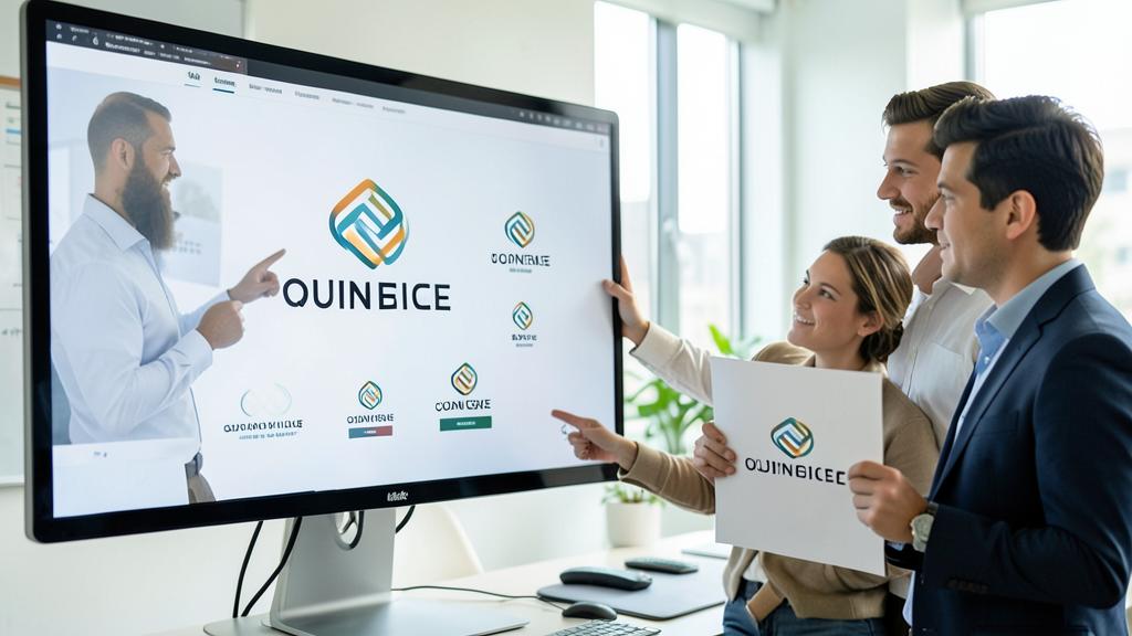
Classic pitfalls. The family committee that votes (the logo becomes a soft compromise—decide on usage criteria, not feelings), the redesign-weather vane every two years (recognition requires constancy), the trendy logo copied from the moment (dated in three years—the sober timeless ages better), and the single low-resolution file (demand vectors and variations, or risk the same problem in five years). A logo is redesigned for ten years: think on a decade scale, not a season.
Frequent questions
How much does a reasonable logo redesign cost?
The range is huge—from the almost-free generators to the complete identity project. For a small business, an intermediate budget with a serious independent, including variations and source files, is the typical investment: over ten years of daily use, it’s negligible.
Should I notify my customers of the change?
For a local clientele that’s attached, a simple word on social media and in-store is enough and even makes a nice communication moment. The key is the rapid and total switch: it’s consistency that reassures, not the announcement.
Should my logo « say » my profession?
Not necessarily—the readability of the name and memorability take precedence over literal illustration (profession pictograms often overload). The activity is the role of the baseline and context; the logo, on the other hand, must above all be recognized.
What to remember
Modernizing your logo is decided based on real costs—unreadable in small size, non-adaptable, dated, technically blocking—never on fatigue alone. The method: identify the one or two traits that carry recognition, preserve them while refining (evolution, not revolution), validate with the three-size test and all variations, and demand the source vector files. Choose the path based on the stakes—professional, tools, or tool-assisted exploration then pro finishing—and handle the transition: rapid switch of all supports, simple word to clients, mini-charter locked in immediately. A successful logo is redesigned for ten years: the ambition isn’t to be trendy—it’s to never have to think about it again.
Your business deserves a real online presence: showcase site, store, SEO—we create the site that reflects you.
Leave a Reply
You must be logged in to post a comment.