
When a visitor arrives on your site, they form an impression in a few seconds, even before reading a word: the colors, typography, logo, and overall style instantly tell them what kind of site they are visiting and whether they can trust it. This is the role of visual identity: the coherent set of graphic elements that give your site its personality and recognizability. A well-crafted and consistent visual identity inspires confidence and professionalism; a messy one undermines your message. Let’s see how to build your site’s visual identity: its components, the principles of a successful identity, and how to create one even without being a designer.
Visual identity: what is it?
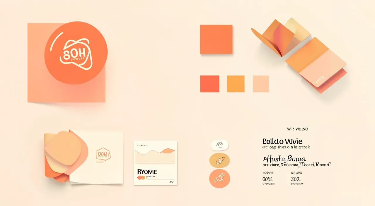
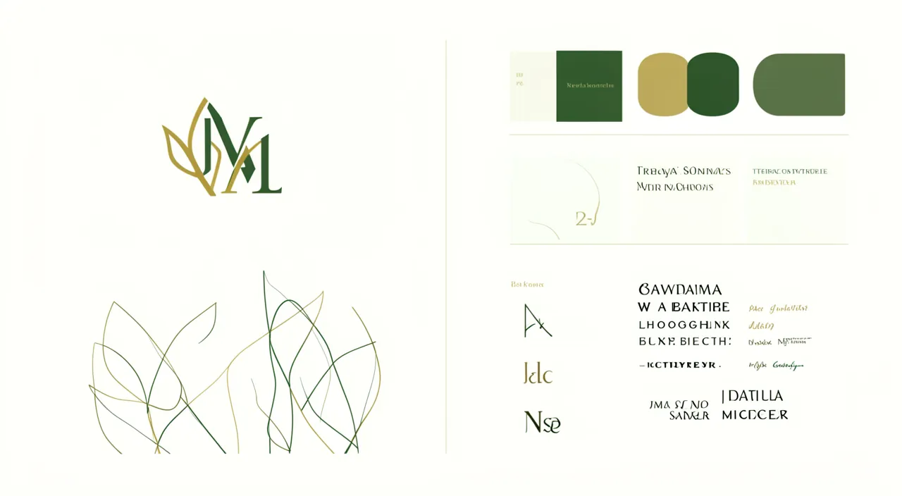
Visual identity is more than just decoration: it’s the graphic personality of your site; here are its components. The DEFINITION: visual identity is the COHERENT set of graphic elements that characterize your site (and your activity); colors, typography, logo, image style, layout; together, they give your site its PERSONALITY and RECOGNIZABILITY; it’s what makes your universe “recognizable.” The MAIN COMPONENTS: the COLORS (your color palette – a few colors that represent you); the TYPOGRAPHY (the fonts used, for headings and text); the LOGO (the symbol of your activity); the STYLE of IMAGES (photos, illustrations – their mood); the LAYOUT (how elements are organized); these components, chosen with coherence, form your identity. Why it’s IMPORTANT: visual identity influences the IMPRESSION your site makes in the first few seconds; a well-crafted and consistent identity inspires CONFIDENCE and PROFESSIONALISM; it makes your site RECOGNIZABLE and MEMORABLE; it conveys the PERSONALITY of your activity; conversely, a messy identity (garish colors, clashing fonts, inconsistency) undermines your message and credibility. COHERENCE, the essential: the key word of visual identity is COHERENCE; the elements must harmonize with each other and be used CONSTANTLY throughout the site; it’s coherence that creates the impression of professionalism and recognizability (we’ll come back to this). No need to be a DESIGNER: you can create a correct visual identity without being a professional designer, by following a few simple principles and using tools; the important thing is coherence and sobriety (we’ll come back to this). Identity in the SERVICE of the message: visual identity should serve your message and activity, not be decorative for its own sake; it should match who you are and your audience; content comes first, form serves it. What it SERVES: to make a good IMPRESSION right away; to inspire CONFIDENCE and professionalism; to be RECOGNIZABLE and memorable; to convey your PERSONALITY; in short, to enhance your site and activity. The main idea: visual identity is the coherent set of graphic elements – colors, typography, logo, image style, layout – that give your site its personality and recognizability. It influences the impression your site makes in the first few seconds: a well-crafted and COHERENT identity inspires confidence and professionalism, while a messy identity undermines your message. Its key word is COHERENCE: harmonious elements, used consistently throughout the site. No need to be a designer to create a correct identity: a few simple principles (coherence, sobriety, alignment with your activity) and tools are enough. Visual identity should serve your message: it enhances your site by giving it a clear personality and a professional image.
The principles of a successful visual identity
A successful visual identity is based on a few simple principles; here’s the essential. COHERENCE above all: the number one principle; use the SAME colors, the SAME fonts, the same style EVERYWHERE on your site; coherence creates the impression of professionalism and makes your site recognizable; inconsistency (colors and fonts that change from page to page) gives a messy and amateurish impression. SOBRIETY: less is often more; limit yourself to a few COLORS (two or three main ones) and a few FONTS (one or two); too many colors and fonts result in a garish and confusing look; sobriety makes for elegance and readability. Choosing a COLOR PALETTE: select a few colors that represent you and harmonize; one main color, one or two accent colors, and neutrals (white, gray); colors have an impact (they evoke moods); choose according to your activity and message. Choosing READABLE TYPOGRAPHY: choose one or two READABLE and suitable fonts; one for headings, one for text, if needed; prioritize readability over originality; a hard-to-read font undermines your site (see our guides on readable typography). READABILITY and CONTRAST: ensure the text is well READABLE; good contrast between text and background, sufficient size; aesthetics should never compromise readability. A SIMPLE LOGO: if you have a logo, it should be SIMPLE, recognizable, and work in both small and large sizes; a cluttered logo is hard to read; simplicity is the strength of a logo (see our guides on creating a simple logo). A COHERENT IMAGE STYLE: choose an image style (photos, illustrations) that matches your identity; high-quality and harmonious images; avoid mixing disparate styles (see our guides on free stock images). ALIGNMENT with your activity: your identity should MATCH what you are and your audience; a serious identity for a serious activity, a playful one for a young audience, etc.; the identity should align with your message and values. SPACE and breathing room: leave space (“whitespace”) around elements; a clean design is more elegant and readable than an overcrowded one; don’t fill everything. SIMPLICITY, a sign of professionalism: in design, simplicity and minimalism often give a more professional impression than clutter; don’t try to do too much; the simple and clean inspire confidence. SET your CHOICES (a style guide): note your choices (exact colors, fonts) to apply them consistently; a small “style guide” (even informal) helps you maintain coherence. In summary, the principles of a successful identity: COHERENCE above all (same colors, fonts, style everywhere), SOBRIETY (few colors and fonts), a carefully chosen palette and typography (readable and suitable), a simple logo, a coherent image style, alignment with your activity and audience, space and breathing room, and simplicity as a sign of professionalism. Note your choices to apply them consistently. A coherent, sober, and suitable visual identity enhances your site; inconsistency and clutter undermine it. Coherence and sobriety are your best allies.
A good visual identity is like a uniform for your website. It’s not about being flashy, but about being consistent. Use the same colors, fonts, and style on every page. Don’t overdo it with too many colors or fancy fonts. Keep it simple and clean, and make sure it matches what your site is about. That’s all you really need to make your site look professional.
Imagine a travel blog that uses a consistent blue color scheme (like ocean blue) with clean white backgrounds and a simple sans-serif font. All photos have a similar warm, adventurous feel. The logo is a simple compass icon. This consistent style makes the site instantly recognizable and professional, even if the designer isn’t a graphics expert.
The secret of a successful identity: coherence and sobriety, more than talent. Many people think a beautiful visual identity requires a designer’s talent or spectacular creations. In reality, the secret is far more accessible: it comes down to two words – COHERENCE and SOBRIETY. Understanding this allows you to create a professional identity even without being a designer. First pillar: COHERENCE. This is by far the most important factor, and the most often neglected. A successful visual identity isn’t necessarily the most original or “creative”; it’s the one that uses the SAME elements – the same colors, the same fonts, the same style – CONSTANTLY throughout the site. It’s this consistent repetition that creates the impression of professionalism, care, and recognizability. Conversely, nothing betrays amateurism more than an inconsistent identity: colors that change from page to page, multiple fonts competing for attention, disparate styles. Even with beautiful elements, inconsistency gives a messy and untrustworthy impression. To ensure coherence, a simple tip: SET your choices from the start (your palette of two or three colors, your font for headings and your font for text) and write them down somewhere; then apply them scrupulously everywhere, without ever deviating. This small discipline – an informal “style guide” – is what makes all the difference between a site that looks professional and a messy one. Second pillar: SOBRIETY. In design, “less is more”: simplicity and minimalism almost always give a more professional and elegant impression than clutter. The classic beginner mistake is to try to do too much: multiplying bright colors, stacking fancy fonts, filling every space, adding effects. The result is garish, confusing, and amateur. Do the opposite: limit yourself to just a few colors (two or three main ones, plus neutrals like white and gray), one or two readable fonts, and leave SPACE (“whitespace”) to breathe around your elements. A clean, airy, and crisp design immediately inspires more confidence than an overloaded design trying to impress. Always prioritize READABILITY (good contrast, sufficient size) over originality: a site that’s easy to read is better than an “original” but unreadable one. These two principles – coherence and sobriety – are within everyone’s reach, without any particular graphic talent; they matter far more than pure creativity. One last tip: your identity should MATCH your activity and audience (serious for a serious activity, warm for a craftsman, etc.); it serves your message, it’s not decorative for its own sake. And many TOOLS exist today to help you (generators of harmonious color palettes, font libraries, simple logo creators), which do part of the work for you. By remembering that coherence and sobriety make a successful identity – far more than talent or originality – you can, even as a beginner, create a site with a professional and polished image that inspires confidence from the first few seconds. Set your choices, apply them everywhere, stay sober and readable: it’s the accessible recipe for a visual identity that enhances your site.
Creating your visual identity, even without being a designer
You can create a correct visual identity without being a designer, with method and tools; here’s how to proceed. DEFINE your PERSONALITY: before the colors, think about what you want to convey; who you are, your values, your audience, your mood (serious, warm, modern, artisanal); your identity should reflect this; content guides form. Choose a COLOR PALETTE: select a few colors that represent you and harmonize; online tools (palette generators) offer harmonious combinations, which is very helpful; choose one main color, one or two accent colors, and neutrals; stick to them. Choose TYPOGRAPHY: choose one or two READABLE and suitable fonts; font libraries (often free) offer a wide choice; prioritize readability and harmony; limit yourself (one or two fonts). A SIMPLE LOGO: if you want a logo, there are tools to create simple ones, or you can hire a designer for this key element; keep it simple and recognizable (see our guides on creating a simple logo). Choose an IMAGE STYLE: define the style of your images (photos, illustrations); use high-quality and consistent images (stock photo banks, your own photos); avoid disparate styles (see our guides on free stock images). Rely on TEMPLATES: site creation tools often offer well-designed TEMPLATES (themes) with a coherent identity; starting from a good template and adapting it to your colors makes the work much easier; no need to start from scratch. APPLY consistently: once your choices are made (colors, fonts, style), apply them COHERENTLY throughout the site; it’s consistency that makes the identity; note your choices to respect them. Use TOOLS: many tools help; color palette generators, font libraries, logo creators, image banks, site templates; they do part of the work and guide you; take advantage of them. STAY simple and sober: don’t try to do too much; sobriety and coherence are better than complexity; a simple, clean, and coherent design is often the most successful. GET FEEDBACK: show your identity to a few people for their opinion; an outside perspective spots what’s wrong; adjust if needed. HIRE a professional (option): for a truly polished identity, or for a logo, hiring a professional designer may be worth it, depending on your means and ambitions; they bring expertise and coherence; consider it for important stakes. In summary, to create your visual identity even without being a designer: first define the personality to convey, choose a harmonious color palette (with the help of tools) and a readable typography, a simple logo, a coherent image style; rely on site templates (already well-designed) and the many available tools; apply your choices consistently; stay simple and sober; get outside feedback; and hire a professional for important stakes if your means allow. Coherence, sobriety, and the right tools allow you to create a professional identity without graphic expertise. Talent helps, but method and coherence do most of the work.
Warning: an inconsistent or overloaded identity (too many colors, fonts) undermines your site – coherence and sobriety inspire confidence, clutter makes it look amateur. This is the most common and damaging mistake in visual identity, and it’s easy to avoid once you’re aware of it. The trap comes from a misleading intuition: you think “adding more” will make the site more attractive, richer, more impressive. It’s the opposite. Two pitfalls, often linked, await the beginner. The first: INCONSISTENCY. Using different colors from page to page, multiple fonts competing for attention, disparate styles (one image in one style, another in another), changing layouts: all this gives a messy, disorganized, and above all UNRELIABLE impression. Yet trust is essential on a site; a visitor who perceives an inconsistent identity subconsciously doubts the seriousness of what they see. Inconsistency is the surest sign of amateurism, even when the elements taken separately are correct. The second pitfall: OVERLOAD. Multiplying bright colors, stacking fancy fonts, filling every available space, adding effects, animations, decorative elements everywhere: the result is garish, confusing, tiring, and paradoxically far less professional than a clean design. An overloaded site gives vertigo, scatters attention, and masks the message you want to convey. The right approach is the opposite of these two pitfalls: COHERENCE and SOBRIETY. For coherence: set once and for all your palette (two or three colors), your fonts (one or two), your style, and apply them IDENTICALLY and CONSTANTLY throughout the site, without ever deviating; note these choices to respect them. This consistency alone transforms a messy site into a polished and professional one. For sobriety: limit yourself drastically – few colors, few fonts, images of the same style, and above all, leave SPACE (“whitespace”) to breathe around your elements rather than filling everything. A clean, airy, and crisp design immediately inspires more confidence and professionalism than an overloaded design trying to impress. Remember this golden rule of design: “less is more.” Two complementary points of vigilance. First, never SACRIFICE READABILITY for aesthetics: a hard-to-read font, text with insufficient contrast (e.g., light text on a light background), text that’s too small, are serious mistakes that make your content inaccessible; readability always comes before originality. Then, make sure your identity MATCHES your activity and audience: an identity should serve your message, not contradict it (e.g., garish colors and a playful style for an activity that wants to be serious and reassuring would create a harmful disconnect). None of this requires a designer’s talent: avoiding inconsistency and overload, staying clean and coherent, prioritizing readability, is within everyone’s reach, and matters far more than pure creativity. Many tools (generators of harmonious palettes, well-designed site templates) help you stay on track. In short, resist the temptation to “add more”: it’s coherence and sobriety that make a successful visual identity and inspire confidence, while inconsistency and overload betray amateurism and undermine your site. Set your choices, apply them everywhere, stay clean and readable: your site will only seem more professional and trustworthy. In design, restraint is a strength.
Frequently asked questions
Do you need to be a designer to create a visual identity?
No: you can create a correct visual identity without being a designer, by following a few simple principles (coherence, sobriety) and using tools; a professional adds value for important stakes, but isn’t essential. Let’s nuance. What you can do YOURSELF: creating a correct and professional visual identity is within everyone’s reach, without graphic expertise; the essential thing isn’t artistic talent but respecting a few SIMPLE PRINCIPLES – COHERENCE (same colors, fonts, style everywhere) and SOBRIETY (few colors and fonts, clean and minimal); these principles, more than talent, make a successful identity, and they’re accessible to all. The TOOLS that help: many tools make the work easier without graphic skills; color PALETTE generators (that choose colors that go well together); font LIBRARIES; simple LOGO creators; IMAGE banks; and especially well-designed SITE TEMPLATES (with a coherent identity), which you just need to adapt to your colors; these tools do most of the work. METHOD, more than talent: by following a simple method (define your personality, choose a palette and a font, apply consistently, stay sober), you get a correct identity without being an artist; coherence and sobriety matter more than pure creativity. When a PROFESSIONAL adds value: hiring a professional designer is valuable in some cases; for a truly polished and distinctive identity; for a QUALITY LOGO (a key element where expertise counts); for an important stake (an activity where image is crucial); if your means allow, a professional brings expertise, coherence, and a more polished result; it’s an investment to consider based on your ambitions and budget. The right CHOICE for your situation: for a personal site, a small business, a limited budget, doing it yourself (with method and tools) gives a perfectly correct result; for an activity where image is a major stake and if the budget allows, a professional may be worth the investment; adapt to your needs and means. The MIXED option: you can also combine; do most of it yourself, and hire a professional for the key element (the logo, for example); a good compromise. In summary, no, you don’t need to be a designer to create a visual identity: by following a few simple principles (coherence, sobriety, alignment with your activity) and using the many available tools (palette generators, font libraries, site templates), you get a correct and professional identity without graphic expertise. Method and coherence matter more than talent. A professional designer adds value for important stakes (polished identity, quality logo) if your means allow, but isn’t essential for a decent result. Do it yourself with method, or combine with a professional for key elements: in all cases, a beautiful identity is within your reach.

How many colors and fonts should you use?
Few: a few colors (two or three main ones, plus neutrals) and one or two fonts; sobriety makes for elegance and professionalism, while multiplying colors and fonts results in a garish and amateur look. Here are the guidelines. For COLORS: limit yourself to A FEW colors; typically, one MAIN color (that represents you), one or two ACCENT colors (that harmonize with the main one), and NEUTRALS (white, gray, possibly black) for backgrounds and text; this limited palette is more than enough and gives a harmonious result; use a palette generator to choose colors that go well together. For FONTS: limit yourself to ONE or TWO fonts; for example, one font for HEADINGS and one for TEXT (or the same everywhere); two well-chosen fonts are enough; beyond that, the result becomes confusing. Why FEW: SOBRIETY is a key principle of design; few colors and fonts give a COHERENT, elegant, and professional result; conversely, multiplying colors (a rainbow) and fonts (each heading in a different font) gives a GARISH, confusing, and amateur result; “less is more”; restraint is classy. COHERENCE in usage: beyond the number, use these colors and fonts CONSTANTLY throughout the site (the same color for the same types of elements, the same fonts everywhere); it’s this consistency that creates the identity; don’t change colors and fonts from page to page. The role of NEUTRALS: white (empty spaces), gray, black (for text) are your allies; they give your design room to breathe and highlight your main colors; don’t neglect them; a design that breathes is elegant. READABILITY first: whatever your choice, make sure the fonts are READABLE and the contrasts sufficient; readability comes before originality. TOOLS help: palette generators offer you harmonious color combinations (often a few colors that go well together); font libraries help you choose readable and matching fonts; take advantage of them to make good, limited choices. The ADVICE: choose a limited palette (one main, one or two accents, neutrals) and one or two readable fonts, and use them consistently everywhere; resist the temptation to add more; sobriety is your friend. In summary, use FEW colors and fonts: a few colors (one main, one or two accents, plus neutrals like white and gray) and one or two readable fonts are more than enough. Sobriety makes for elegance and professionalism, while multiplying colors and fonts gives a garish and amateur result. Beyond the number, the essential thing is to use these elements COHERENTLY and consistently throughout the site. Use palette generators for harmonious colors, prioritize readability, and give your design room to breathe. Few, but well-chosen and coherent: that’s the recipe for a successful visual identity.
How to choose colors that go well together?
Use palette generator tools (which suggest harmonious colors), start with a main color, limit yourself to a few colors, and think about the mood you want to convey; readability and coherence come first. Here’s how to proceed. Use PALETTE generator tools: the easiest way to get harmonious colors; there are online tools (color palette generators) that suggest COLOR COMBINATIONS that go well together; you start with a color or a mood, and the tool suggests a harmonious palette; this avoids bad taste and guides you toward successful associations; take advantage of them, they do the harmony work for you. START with a main color: first choose your MAIN COLOR (the one that represents you, in line with your activity and message); then build the palette around it (harmonious accent colors, neutrals); a palette generator helps you find colors that match your main one. LIMIT the number: a few colors are enough (one main, one or two accents, neutrals like white and gray); don’t multiply colors, or you’ll get a garish result; sobriety makes for harmony. Think about the MOOD: colors evoke MOODS and emotions; think about what you want to convey (serious, warmth, calm, dynamism) and choose colors in line with that; your palette should serve your message and match your activity and audience. Use NEUTRALS: white, gray, black (for text and backgrounds) go well with your colors and give your design room to breathe; they’re essential for an elegant result; don’t build a palette with only bright colors. Think about READABILITY and CONTRAST: beyond harmony, make sure your colors allow for good CONTRAST for readability (e.g., dark text on a light background); beautiful colors with poor contrast make the text unreadable; readability always comes first. GET INSPIRED: look at sites you find successful, note their color combinations; get inspired (without copying) by what works; observation helps develop your taste. TEST and adjust: try your palette on your site, see the result, get feedback; adjust if something’s off; colors can look different on screen. COHERENCE in usage: once your palette is chosen, use it COHERENTLY everywhere (same colors for the same uses); it’s consistency that makes the identity. The ADVICE: start with a main color linked to your message, use a palette generator to find harmonious colors, limit yourself to a few colors plus neutrals, ensure good contrast for readability, and use everything coherently. In summary, to choose colors that go well together: use PALETTE generator tools (which suggest harmonious combinations and avoid bad taste), start with a MAIN COLOR linked to your message, LIMIT yourself to a few colors plus neutrals (white, gray), think about the MOOD you want to convey, and ensure good CONTRAST for readability. Get inspired by successful sites, test and adjust, and use your palette coherently everywhere. The tools do the harmony work for you: with their help and these simple principles, you’ll get a harmonious and professional palette, even without being a colorist.
What to remember
Visual identity is the coherent set of graphic elements – colors, typography, logo, image style, layout – that give your site its personality and recognizability. It’s crucial because it influences the impression your site makes in the first few seconds, even before anyone reads a word: a well-crafted and consistent identity inspires confidence and professionalism, while a messy one undermines your message and credibility. The secret of a successful identity comes down to two words, within everyone’s reach: COHERENCE and SOBRIETY – far more than graphic talent or originality. COHERENCE is the most important factor: use the SAME colors, the SAME fonts, the same style CONSTANTLY throughout the site; it’s this repetition that creates the impression of professionalism and recognizability, while inconsistency (colors and fonts that change from page to page) is the surest sign of amateurism. To ensure it, set your choices from the start (an informal “style guide”) and apply them scrupulously everywhere. SOBRIETY is the second pillar: “less is more”; limit yourself to a few colors (one main, one or two accents, plus neutrals like white and gray) and one or two readable fonts, and leave SPACE to breathe around your elements; a clean, airy, and crisp design inspires more confidence than an overloaded design trying to impress. Resist the temptation to “add more” (too many colors, fonts, effects): overload gives a garish and amateur result. Never SACRIFICE READABILITY for aesthetics (good contrast, sufficient size: readability comes before originality), and make sure your identity MATCHES your activity and audience (it serves your message, it’s not decorative for its own sake). Good news: you can create a correct and professional identity WITHOUT being a designer. Method and coherence matter more than talent, and many TOOLS help you: generators of harmonious color palettes (which do the harmony work for you), readable font libraries, simple logo creators, image banks, and especially well-designed SITE TEMPLATES that you just need to adapt to your colors. Proceed with method: first define the personality to convey, choose a palette and typography (with the help of tools), a simple logo, a coherent image style, rely on a good template, apply your choices consistently, stay sober, and get outside feedback. For important stakes and if your means allow, hiring a professional designer adds value (polished identity, quality logo), possibly in combination (do most of it yourself, a professional for the logo). In short, a successful visual identity doesn’t require exceptional talent or spectacular creations: it’s based on coherence (the same elements everywhere), sobriety (few colors and fonts, clean and airy), readability, and alignment with your message. These accessible principles, served by the right tools, allow everyone, even beginners, to give their site a professional and polished image that inspires confidence from the first glance. Set your choices, apply them everywhere, stay clean and readable: it’s the recipe for a visual identity that enhances your site in the long run.

Your activity deserves a real online presence: showcase site, store, SEO – we create the site that’s right for you.
Leave a Reply
You must be logged in to post a comment.