
This is the first thing a visitor sees when arriving on your site: the homepage banner, that large space at the top of the homepage, often an image with a title. In a few seconds, it must convey who you are, what you offer, and give the desire to stay. A successful banner captures attention and guides; a failed banner (blurry, silent, or just « pretty » but meaningless) loses the visitor right away. Taking care of your homepage banner means taking care of your first impression. Here’s how to design a banner that hooks, informs, and invites action.
The role of a homepage banner
The banner (sometimes called « hero » or homepage header) occupies the top of your homepage, the area seen first, even before scrolling. Its role is crucial. It gives the FIRST impression: in a few seconds, the visitor forms an idea of your site; this impression conditions their decision to stay or leave. It MAKES UNDERSTAND the essential: who you are, what you offer, who you’re addressing? The visitor must grasp it immediately, without effort. It CAPTURES attention: a beautiful image, a strong message catch the eye and make you want to see more. It GUIDES: it invites to take action (discover, contact, buy) or to explore the site. It sets the TONE: it immediately conveys the atmosphere, the style, the seriousness of your activity. What does a good banner contain? A CLEAR and STRONG title: which says in a few words what you do or bring (not just your name). A subtitle or an EXPLANATORY PHRASE. A QUALITY IMAGE or visual, relevant to your activity. An ACTION BUTTON (a call to action: « Discover, » « Contact Us, » « See Our Services »). The whole SOBRE and readable, not overloaded. Errors to avoid (detailed below): a banner that is « pretty » but says NOTHING; unreadable text on the image; an image too heavy that slows down; the absence of a call to action. What is it for? To SUCCEED in your first impression; to make your activity UNDERSTOOD immediately; to CAPTURE and retain the visitor; and to GUIDE them toward action. The key idea: the homepage banner is your first impression, made in a few seconds; it must, at a glance, convey who you are and what you offer, capture attention, and invite action. The number one trap is the « pretty but silent » banner: a beautiful image without a clear message, leaving the visitor wondering « what is this? ». A successful banner is not just aesthetic: it is clear, expressive, and action-oriented.
A homepage banner is like a handshake: it must be firm, clear, and say something about you. In just a few seconds, it should tell visitors who you are, what you do, and why they should stay. If it’s just a pretty picture without a message, they’ll leave before even reading more.
How to design an effective banner
Here’s how to succeed in this first impression. A CLEAR and STRONG TITLE — this is the most important element: in a few words, say what you DO or what you BRING to the visitor, not just your name; the visitor must instantly understand what it’s about (« Create the website of your dreams, » « Your trusted plumber in Lyon, » « Homemade cakes for your events »). An EXPLANATORY PHRASE — under the title, a short phrase specifies your offer or your value; brief and concrete. A QUALITY and RELEVANT IMAGE — choose a well-crafted visual, relevant to your activity, that sets the tone; avoid generic and soulless images; a photo of YOUR work is better than a generic illustration (our guides find free-to-use images). A CLEAR ACTION BUTTON — invite to the next step: « Discover, » « Contact Us, » « See Our Work »; a single main button, clearly visible, guides the visitor (our guides clear and easy-to-click buttons). Ensure TEXT READABILITY — if your text is on the image, it must remain perfectly readable: darken the image behind the text, or place the text on a plain area; an unreadable title on a busy image is useless. Stay SOBRE — don’t overload the banner with text, multiple messages, or multiple buttons; one main message, one main action; clarity is key. OPTIMIZE the image — the banner is at the top of the page, so it loads first; a too-heavy image slows down the entire site upon arrival; optimize it imperatively (our guides optimize your images for the web). Think MOBILE — check that the banner displays well on phone: the title remains readable, the image adapts, the button is accessible; on mobile, the banner takes up the entire homepage screen, it’s crucial. TEST the impression — look at your banner as a visitor discovering it: can you understand in three seconds who you are and what you offer? If not, rework the title. A few TIPS: the TITLE first (the rest follows); clarity before beauty; and one main action. In summary: a clear and strong title that says what you bring, a short explanation, a relevant and optimized image, an action button, readable text, sobriety, and a mobile check. A banner designed this way succeeds in your first impression and guides the visitor.
The right reflex. The number one trap of the homepage banner is the beautiful but SILENT image: a magnificent visual, maybe your name in large, but nothing that says what you DO — and the visitor, arriving on your site, wonders « what is this, exactly? » before leaving. Avoid this trap by taking care of the TITLE first. It must not just display the name of your company: it must say, in a few clear words, what you bring or to whom you are addressing. Compare « Maison Durand » (silent) and « Maison Durand — Your custom cakes for all your events » (expressive): in one second, it’s understood. Do the decisive test: show your banner to someone who doesn’t know your activity, and ask them to say, in three seconds, what you offer; if they hesitate, your title isn’t clear enough. Once the title is set, add a short explanatory phrase, a single and clearly visible ACTION BUTTON (« Discover, » « Contact Us ») that says what to do next, and a QUALITY IMAGE relevant to your activity — preferably a photo of YOUR work rather than a generic and soulless illustration. Two technical reflexes not to forget: make sure the text remains perfectly READABLE on the image (darken the background behind the title if needed; a title lost in a busy image is useless), and OPTIMIZE the image, because the banner loads first — a too-heavy image slows down your entire site upon the visitor’s arrival, the worst of first impressions. Finally, check the rendering on MOBILE, where the banner takes up the entire homepage screen. An expressive title, a clear action, a beautiful and readable light image: in three seconds, the visitor knows who you are, what you offer, and what to do. That’s a successful first impression.
A bakery’s homepage banner could feature a high-quality photo of freshly baked bread with the title « Freshly Baked Bread, Delivered Daily » and a subtitle « Artisanal pastries for your breakfast or events ». The action button could say « Order Now ». The image is optimized for fast loading, and the text is clearly readable against a darkened background. On mobile, the banner adapts perfectly, and the button is easy to tap. This banner immediately tells visitors what the bakery offers and encourages them to take action.
Mistakes that ruin the first impression
A failed banner scares visitors away upon arrival; here are the mistakes to absolutely avoid. The SILENT banner: the queen of errors; a beautiful image without a clear message, that doesn’t say what you do; the visitor doesn’t understand and leaves; the title must always SPEAK. The UNREADABLE text: a title placed on a busy image, without contrast, becomes indecipherable; darken the background or place the text on a plain area. The TOO HEAVY image: the banner loads first; an unoptimized image slows down the entire site upon arrival, and scares visitors away before the page even loads; optimize it imperatively. The OVERLOAD: too much text, multiple messages, multiple buttons; the visitor is overwhelmed; one message, one action. The absence of a CALL to action: a banner that invites to nothing leaves the visitor without direction; give them a next step. The GENERIC image: a generic illustration photo, seen everywhere, without a real link to you, sounds fake and impersonal; prefer an authentic image of your work. The LONG CAROUSEL: some banners automatically scroll through several images/messages; this is often counterproductive (the visitor doesn’t read, the messages are diluted, it slows down); a fixed and strong message is often more effective. The MOBILE neglected: a banner that looks great on computer but is unreadable or poorly framed on phone misses the majority of visitors; test it. The text over the ENTIRE HEIGHT: a banner so large that you see NOTHING else without scrolling can frustrate; leave a hint that there’s content below. The RIGHTS on the image: only use images you have the rights to (our guides find free-to-use images). In summary: avoid the silent banner (title must always speak), unreadable text, too-heavy image, overload, absence of button, generic images, useless carousels, and mobile neglected; respect image rights. Each of these mistakes ruins your first impression; avoiding them is already succeeding in your banner.
Warning: a too-heavy banner image ruins your site in the first second. This is a technical trap with major consequences, often overlooked. The homepage banner is, by definition, at the TOP of your page: it’s therefore the first element the browser loads when a visitor arrives. If you place a large unoptimized image there — a raw photo of several megabytes and thousands of pixels — the visitor must download this huge weight BEFORE seeing anything. Result: your site takes long seconds to display its homepage, and many people leave before the page even opens. It’s the ultimate: a banner meant to seduce that, because of its weight, instantly scares visitors away. Therefore, OPTIMIZE your banner image (reduce its dimensions and compress its weight) before putting it online; this is non-negotiable. Second danger: the UNREADABLE text on the image. A banner often superimposes a title on a visual; if the image is clear or busy where the text is, the title becomes indecipherable, and your message — the most important — is lost. Darken the area of the image behind the text, or place the title on a plain strip; the contrast must be perfect. Third point of vigilance: the SILENT banner, already mentioned but that can’t be repeated enough: a beautiful image without an expressive title is a missed opportunity; the visitor must understand in one second what you offer, otherwise they leave. Don’t forget MOBILE either, where the banner takes up the entire homepage screen and where these flaws (slowness, unreadability) are even more penalizing; test it absolutely. Finally, only use images you have the RIGHTS to. A banner is your first impression; don’t sabotage it with a too-heavy image that scares visitors away, unreadable text that loses your message, or a visual you don’t have the right to. Light, readable, expressive: these are the three requirements of a banner that welcomes instead of repelling.
Frequent questions
What should you write on the homepage banner?
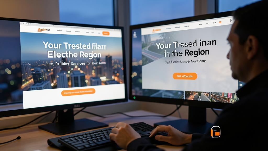
The essential lies in one principle: the title must say what you DO or what you BRING, not just your name. This is the most common mistake: displaying just « Company Untel » in large, which says nothing to the visitor discovering it. Instead, formulate a CLEAR and EXPRESSIVE title that, in a few words, makes your activity or value understood: « Your trusted electrician in the region, » « Training to master computer science at your own pace, » « Creative florist for your most beautiful events. » In one second, it’s clear what it’s about. Under this title, add a short EXPLANATORY PHRASE that specifies your offer, your specialty, or what sets you apart; brief and concrete, not a paragraph. Complete with an ACTION BUTTON that indicates the next step: « Discover Our Services, » « Request a Quote, » « Contact Us. » That’s the winning structure: expressive title, supporting phrase, action button. What to AVOID: a vague or purely decorative title (« Welcome » alone says nothing), too much text that drowns the message, or competing messages. Stay SOBRE and FOCUSED: one main message, one main action. The best test: have someone who doesn’t know your activity read your banner, and ask them to summarize, in one sentence, what you offer; if they can do it on the first try, your banner is successful; if they hesitate, rework the title. The banner is not the place to say everything: it’s the place to make the essential understood and give the desire to go further.
Should you put an image, a video, or a carousel?
A beautiful fixed and well-chosen image is often the best choice: simple, effective, and without the drawbacks of other options. The FIXED IMAGE has all the advantages: it loads quickly (if optimized), delivers a clear and stable message, and works everywhere; choose a quality visual, truly relevant to your activity (ideally a photo of your work rather than a generic image), and you have an effective banner. The CAROUSEL (several images/messages that automatically scroll) is very common but often counterproductive: the visitor generally only reads the first image, the following messages are ignored, the automatic scrolling can annoy or go too fast, and it slows down loading. In most cases, a fixed and strong message is better than a carousel that dilutes attention. The VIDEO banner can be spectacular and immersive, but it has a cost: it significantly slows down loading (risk of slowing down the entire site), may consume data on mobile, and isn’t always relevant; if you insist, make sure it’s light, short, without automatic sound, and that your message remains understandable without it. In summary, for the vast majority of sites, a QUALITY FIXED IMAGE, optimized and well-chosen, with an expressive title and an action button, is the safest and most effective solution. Reserve video for cases where it truly adds something and where you can control its weight; and be wary of the carousel, appealing in appearance but often less effective than a good single message. Simplicity, here as often, is your ally.
Should my banner take up the entire screen?
It can be large and take up a good part of the homepage screen — this is even common and often effective to make an impression — but with a nuance: don’t completely hide the fact that there’s content below. A generous banner, which takes up a large part of the first screen, has advantages: it captures attention, sets a strong first impression, and highlights your message and visual. This is especially true on mobile, where the banner naturally fills the homepage screen. However, an excess lurks: if your banner takes up the ENTIRE SCREEN without the slightest hint that there’s more below, some visitors may think the page ends there, or not think to scroll. To avoid this, LET THE REST BE GUESSED: let a small part of the following content appear at the bottom of the screen, or add a discreet hint inviting to scroll; thus, the visitor understands that there’s more to discover. The other point of attention is not to make the banner so high that the visitor must scroll long before reaching useful information; keep a balance. In summary: yes, a banner can be large and take up a good part of the homepage screen for its impact; just make sure it remains fast (optimized image), readable, and that it lets the visitor guess there’s content below, to avoid giving the impression of a dead end. The important thing is not so much its exact size as its clarity and effectiveness in making it understood who you are and inviting to explore further.
What to remember
The homepage banner — that large space at the top of your homepage — is your FIRST impression, made in a few seconds, and it conditions the visitor’s decision to stay or leave. It must, at a glance, make it UNDERSTOOD who you are and what you offer, CAPTURE attention, set the TONE, and INVITE to action. A good banner contains: a CLEAR and STRONG title that says what you bring (not just your name), a short explanatory phrase, a QUALITY and RELEVANT image, and an ACTION BUTTON — all sober and readable. The number one trap is the « pretty but SILENT » banner: a beautiful image without a clear message, leaving the visitor wondering what it’s about before leaving; therefore, take care of the title first, and do the test of showing it to someone who doesn’t know you — do they understand in three seconds? Also beware of three major technical pitfalls: the TOO HEAVY image (the banner loads first; an unoptimized image slows down the entire site upon arrival and scares visitors away: optimize it imperatively), the UNREADABLE text on the image (ensure strong contrast, darken the background behind the title), and MOBILE neglected (test it, the banner takes up the entire screen). Also avoid overload (one message, one action), absence of a call to action, generic and soulless images (prefer a photo of your work), and often counterproductive carousels (a fixed and strong message is better). Respect image rights. A successful banner is not just aesthetic: it is clear, expressive, light, and action-oriented. In three seconds, it must answer the visitor’s questions: who are you, what do you offer, and what to do next? Take care of this first impression: it’s what decides whether the visitor stays — or leaves without ever discovering everything you had to offer.
Your activity deserves a real online presence: showcase site, store, SEO — we create the site that suits you.
Leave a Reply
You must be logged in to post a comment.