
Your visitors want to know, at a glance, what you OFFER. A clear and convincing « Services » (or « Offerings ») page is often the decisive page of your website: that’s where the visitor understands what you do, if they need it, and why to choose you. Too many sites rush it: vague lists, jargon, lack of concrete benefits, no call to action. Result: the visitor doesn’t understand and leaves. Here’s how to design a service presentation page that informs, convinces, and turns the visitor into a client.
Why a good Services page is decisive
This page deserves special attention: here’s why it’s strategic. That’s where the DECISION is made: after discovering who you are, the visitor comes to see what you OFFER concretely; if they understand quickly and feel concerned, they take action (contact you, buy); if they’re lost, they leave. It’s your COMMERCIAL SHOWCASE: it presents your offer, its value, its benefits; it’s often the most visited page after the homepage, and the one that precedes contact. It must answer the visitor’s QUESTIONS: « What exactly do you offer? Does it match my need? What do I gain? How much does it cost? How does it work? Why you rather than someone else? How to contact you? » A good page anticipates and answers these questions. Common MISTAKES that drive visitors away: a VAGUE or jargon-filled list of services (the visitor doesn’t understand what it brings them); talking about YOURSELF rather than the client’s need (the client doesn’t care about your processes, they want to know what it changes for THEM); lack of CONCRETE BENEFITS; no PROOF (testimonials, examples); no CLEAR CALL TO ACTION; a confusing, poorly structured page. The FUNDAMENTAL PRINCIPLE: speak from the CLIENT’S perspective and their BENEFIT, not just your services. The client isn’t looking for « a service »: they’re looking for a SOLUTION to their problem, a result, a benefit; present your services from this angle (« what it brings you ») rather than the technical angle (« what I do »). What to remember to start: the Services page isn’t just a catalog of what you can do; it’s a clear, client-oriented argument, showing each visitor that you have THE solution to THEIR need, and guiding them toward action. It’s often the page that makes the difference between a site that informs and a site that converts.
Structuring and writing your Services page
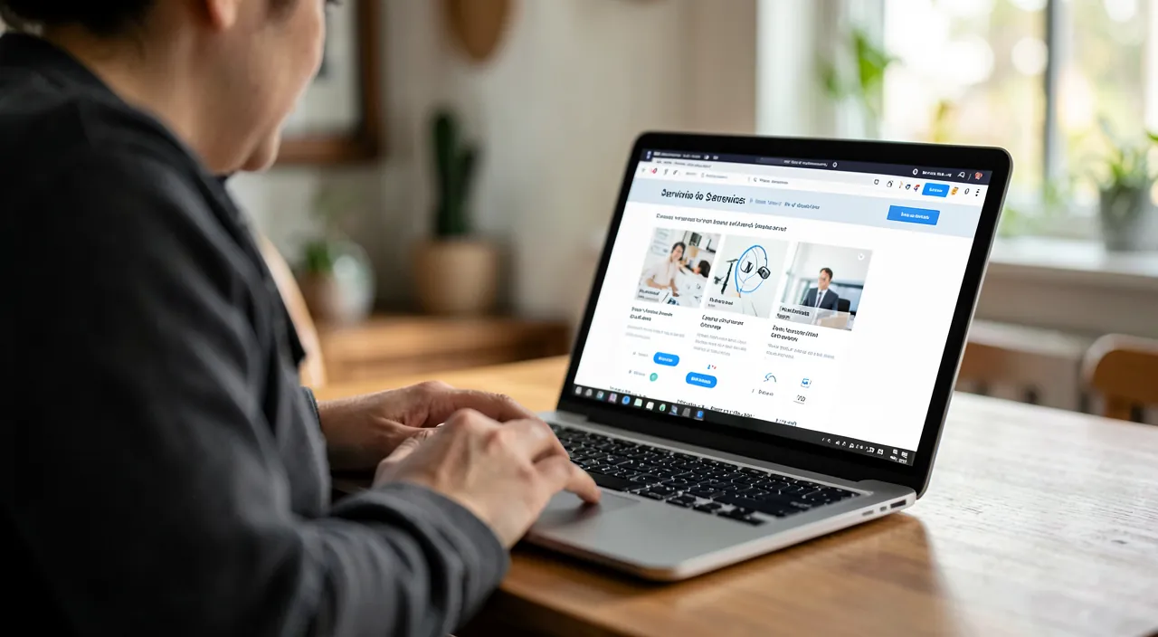
Let’s see how to organize and write this page to make it clear and convincing. Start with a HOOK: at the top of the page, a sentence that summarizes what you bring and to whom; the visitor must understand in 5 seconds if they’re in the right place. PRESENT each service clearly: for each, indicate what it is, FOR WHOM, and especially the BENEFIT (what it solves, what it brings); a clear title, a concise description, result-oriented. STRUCTURE visually: present your services in BLOCKS or distinct sections (often with an icon or image, a title, a short description); it’s more readable than a long text; the visitor quickly spots what interests them. Adopt the CLIENT’S language: speak like them, avoid TECHNICAL JARGON; phrase in terms of benefits (« save time, » « sleep peacefully, » « an interior that suits you ») rather than technical terms. Provide PROOF: client testimonials, examples of work, figures, guarantees; proof reassures and builds credibility; integrate them on the page or nearby. Explain the PROCESS if relevant: how it works (the steps), which reassures the client about the concrete. Address PRICING intelligently: depending on your activity, display the rates, a range, « from, » or a « quote » with an invitation to request; not talking about price at all can slow things down (the visitor imagines the worst or doesn’t dare ask); find the right level for your sector. Anticipate OBJECTIONS and questions: a small FAQ can remove obstacles. END with a clear call to action: « Contact us, » « Request a quote, » « Make an appointment, » with a visible button; don’t leave the convinced visitor without telling them what to do next (see our guides on crafting effective calls to action). Stay CONCIS and CLEAR: get to the point; a visitor skims; short texts, explicit titles, airy layout. In summary for writing: clear hook → services presented in benefit-oriented blocks → proof → process and pricing → call to action; all in the client’s language, concise, and well-structured. A page built this way naturally guides the visitor from discovering your offer to making contact.
The Services page is where visitors decide if you can solve their problem. It must quickly show what you offer, who it’s for, and what they gain – not just what you do technically. Think of it as a salesperson who immediately understands the customer’s needs and explains how you can help.
A web designer’s Services page might structure offerings like this:
- Professional Website (benefit-focused title)
- For small businesses needing an online presence
- Get a beautiful, mobile-friendly site that attracts customers (benefit)
- From $2,500 (price indication)
- E-commerce Store
- For retailers ready to sell online
- Sell 24/7 with a secure, easy-to-manage store (benefit)
- Quote request (for customized pricing)
Each service block clearly shows what the client gets, not just technical features.
The secret of an effective Services page: talk BENEFITS, not features. This is THE principle that turns a bland Services page into one that converts. The difference: a FEATURE describes what you do (your service, your technique, your process); a BENEFIT describes what the client GAINS (the result, the relief, the improvement in THEIR life). The client isn’t first interested in your features: they’re interested in what it changes for THEM. Examples: instead of « I create WordPress sites with responsive design » (technical feature that doesn’t speak to the client), say « a professional website that brings you clients, beautiful on all screens » (benefit); instead of « cleaning with eco-friendly products » (feature), say « come home to a spotless and healthy interior, without lifting a finger » (benefit); instead of « accounting and declarations » (feature), say « focus on your business, we handle the paperwork and you sleep peacefully » (benefit). The method: for each service, ask yourself « and then? what does the client gain? » — and phrase the answer. Place the BENEFIT upfront (in the title, the first sentence), the technical feature afterward (for those who want details). Speak to « YOU » (the client) more than « I » (you); count your « I/we » against your « you/your »; if you talk mostly about yourself, reorient toward the client. This simple shift — presenting each service by what it BRINGS to the client rather than what it IS — makes your page immediately more engaging, more convincing, and far more effective at turning a visitor into a client. It’s the mindset that distinguishes Services pages that sell from those that leave visitors indifferent.

Highlighting and converting
Beyond the content, a few elements enhance the effectiveness of your Services page. Take care of the VISUALS: quality images (your work, your universe) illustrate and build credibility; clear icons for each service; an airy, professional layout (see our guides on finding free images). Facilitate READING: explicit titles, short texts, bullet points for key points, highlighting important elements; the visitor must be able to SKIM and capture the essence without reading everything. Highlight your DIFFERENCE: why YOU rather than someone else? Your specialty, your approach, your added value; it’s often what tips the scales. Reassure with VISIBLE PROOF: client testimonials (with name/photo if possible, they’re more credible), client/partner logos, certifications, concrete examples, guarantees; social proof is a powerful trust lever. Multiply CALLS TO ACTION: a contact/quote button at the top, middle, and bottom; at every moment the visitor is convinced, offer them a way to act immediately; the button must be visible and the label clear and engaging. Facilitate CONTACT: a simple form, a call or appointment button; reduce friction; the easier it is to reach you, the more it happens (see our guides on creating an effective contact form). Think MOBILE: the majority of visitors are on mobile; check that the page is perfectly readable and that buttons are easy to tap on a small screen. Link to OTHER pages: links to your portfolio, your « About » page, your blog; guide the journey. Stay COHERENT with the rest of the site (tone, graphic charter). MEASURE and improve: observe if the page generates contacts; if few visitors take action, revise the clarity, benefits, and calls to action. In summary: take care of the visuals and readability, assert your difference, show proof, multiply calls to action, and facilitate contact, all optimized for mobile. These elements transform an informative page into a CONVERTING one: it’s the ultimate goal of a successful Services page.
Beware of errors that drive visitors away: jargon, self-centeredness, confusion, and lack of call to action. Several classic pitfalls ruin the effectiveness of a Services page: avoid them. JARGON and vagueness: describing your services in technical, abstract, or vague terms (« innovative solutions, » « comprehensive support, » « synergies ») says NOTHING concrete to the visitor, who doesn’t understand what you do or what it brings them; speak clearly, concretely, in the client’s language. SELF-CENTEREDNESS: talking mostly about YOURSELF (your story, your methods, your processes, your degrees) instead of the CLIENT’S need and benefit; the visitor wants to know what it changes for THEM, not admire your journey; reorient everything toward the client and their problem. Lack of BENEFITS: listing services without explaining what they bring leaves the visitor indifferent; each service must answer « what do I gain? » CONFUSION: a messy page, with no clear structure, a digestible wall of text, discourages; structure in blocks, aerate, title. SILENCE on pricing: giving NO indication of rates (no range, no « from, » no « quote ») can slow things down; some visitors imagine the worst or don’t dare ask; give at least an indication or a clear invitation to request. Lack of CALL TO ACTION: this is the fatal error; a convinced visitor who doesn’t know what to do next (no contact button, no « request a quote ») leaves without acting; always clearly state the next step and make it easy (see our guides on crafting effective calls to action). Lack of PROOF: without testimonials, examples, or guarantees, the hesitant visitor doubts; add social proof. Forgetting MOBILE: a page unreadable or with tiny buttons on smartphones drives away the majority of visitors; test on mobile. Finally, don’t PROMISE what you can’t deliver: exaggerated promises attract then disappoint; stay honest, trust lasts longer than hype. By avoiding these errors — jargon, self-centeredness, lack of benefits and call to action, confusion, silence on pricing, lack of proof, forgetting mobile — your Services page stops driving visitors away and starts converting: it clearly informs, reassures, and guides the visitor toward contact.

Frequently asked questions
Should you display your prices on the Services page?
It depends on your activity, but giving AT LEAST an indication is generally recommended. Saying NOTHING about prices can SLOW THINGS DOWN: some visitors, finding no pricing information, imagine it’s expensive, don’t dare ask, or go see a more transparent competitor elsewhere. Depending on your sector, several options: DISPLAY the rates (ideal for standardized services: this qualifies visitors, those who contact you already know what to expect); give a RANGE or a « from » (useful when prices vary according to needs: this gives a rough idea without committing to a fixed amount); indicate « quote » with a clear invitation to request (for highly customized services: but accompany it with an easy call to action to avoid frustration). What to avoid: total silence, which leaves the visitor in the dark. The advantage of giving an indication: it QUALIFIES your contacts (those who reach out are in your price range, less wasted time on both sides) and builds trust (transparency). Think about what’s usual and effective in YOUR sector, and your strategy; but in doubt, a rough idea (« from, » a range) is better than nothing. The essential thing is that the visitor leaves with an idea, and especially with a simple way to request a quote or more information.
How to present multiple services without confusion?
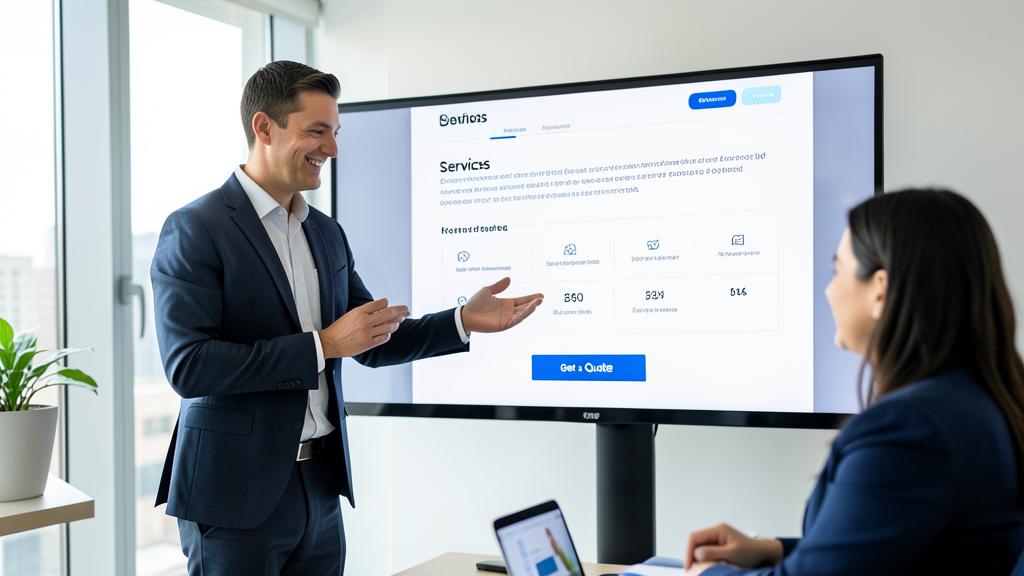
The key is VISUAL STRUCTURE and clarity. Present each service in a DISTINCT BLOCK (a section, a card) rather than in a continuous long text: usually an icon or small image, a CLEAR TITLE (which states the benefit, not just the technical name), and a CONCIS DESCRIPTION (2-3 benefit-oriented sentences). This block presentation allows the visitor to SKIM and immediately spot the service that interests them, without having to read everything. A few principles: ORDER your services logically (the most important or requested first); LIMIT the number of services highlighted (if you have many, group them by categories, or highlight the main ones and detail the rest elsewhere; a page with twenty services in a jumble loses the visitor); stay CONCIS for each (the visitor wants the essentials; if they want more details, you can link to a dedicated page per service); keep a COHERENT PRESENTATION (all blocks in the same format: title + description + optional button). Aerate the layout (space between blocks), use explicit titles, and possibly bullet points for key points. If your services are complex or numerous, consider a synthetic Services page (presenting the whole in blocks) that links to detailed pages per service; thus the main page remains clear, and details are accessible for those who seek them. In summary: distinct, clear, concise, consistent, and well-ordered blocks; it’s the structure that avoids confusion and allows everyone to quickly find what concerns them.
What to highlight to convince?
Three things above all: the BENEFITS, your DIFFERENCE, and PROOF. The BENEFITS for the client: this is the most important; don’t just present WHAT you do, but what the client GAINS (the result, the problem solved, the improvement in their life); speak from their perspective, in their language; this is what makes them feel concerned. Your DIFFERENCE: why choose YOU rather than a competitor? Your specialty, your unique approach, your experience, your proximity, your guarantee; identify what sets you apart and highlight it; it’s often what makes the decision when the visitor compares. PROOF: nothing convinces as much as proof that others have trusted you and are satisfied; highlight client testimonials (even more credible with a name, a photo), examples of work, figures (number of clients, years of experience), client/partner logos, certifications, guarantees; this « social proof » reassures the hesitant visitor. To this add: CLARITY (a visitor who understands quickly is a reassured visitor), ease of CONTACT (visible calls to action), and VISUAL PROFESSIONALISM (quality images, a well-crafted layout, that inspire confidence). In summary, to convince: show what the client gains (BENEFITS), why you’re the right choice (DIFFERENCE), and that others already trust you (PROOF); all clearly presented and with an obvious path to contact. It’s this combination that turns interest into action.
What to remember
The « Services » page is often decisive: that’s where the visitor understands what you offer, if they need it, and why to choose you; it’s the page that precedes contact. The FUNDAMENTAL PRINCIPLE: speak from the CLIENT’S perspective and their BENEFIT, not just your services; the client isn’t looking for « a service » but a SOLUTION to their problem; present each service by what it BRINGS (result, benefit) rather than what it IS (technical feature) — that’s the secret of a converting page. STRUCTURE it this way: a clear HOOK (the visitor understands in 5 seconds if they’re in the right place) → your services presented in DISTINCT BLOCKS (icon/image + benefit-oriented title + concise description) → PROOF (testimonials, examples, guarantees) → the process and a PRICE indication (don’t stay completely silent on rates) → a CLEAR and VISIBLE CALL TO ACTION (contact, request a quote). All in the CLIENT’S LANGUAGE (no jargon), concise, airy, and speaking to « you » more than « I. » To CONVERT: take care of the visuals and readability, assert your DIFFERENCE (why you), show visible proof, multiply calls to action, facilitate contact, and optimize for MOBILE (the majority of visitors). ERRORS to absolutely avoid: jargon and vagueness, self-centeredness (talking about yourself rather than the client), lack of concrete benefits, confusion (poorly structured page), total silence on prices, lack of proof, forgetting mobile, and especially lack of call to action (a convinced visitor who doesn’t know what to do leaves). Don’t promise what you can’t deliver. A successful Services page isn’t a catalog: it’s a clear, client-oriented argument, showing each visitor that you have THE solution to THEIR need and guiding them toward action. It’s often what makes the difference between a site that informs and a site that turns visitors into clients.



Your business deserves a real online presence: showcase site, store, SEO — we create the website that suits you.
Leave a Reply
You must be logged in to post a comment.